
TEXTUAL ANALYSES
On this page of the website you will find the analyses for three posters, three magazines and three trailers.
POSTERS

|
POSTER NAME: The Last House On The Left RELEASE DATE: March 2009 DIRECTOR: Dennis Iliadis PRODUCTION COMPANY: Crystal Lake Entertainment CAST: Sara Paxton as Mari, Garret Dillahunt as Krug, Monica Potter as Emily, Tony Goldwyn as John, Aaron Paul as Francis. Remake of The Last House On The Left which was released in 1972, directed by Wes Craven. SYNOPSIS: The same night Mari and her friend arrive at Collingwood Lakehouse they are both kidnapped by Krug (a prison escapee) and his gang. Mari eventually goes home to find that her parents Emma and John unknowingly invited the gang into their home. However after the family found out the gruesome details of what the gang did to Mari and her friend they make them regret coming to ‘The Last House On The Left’. |
DENOTATION: This poster displays a house that looks like it is in the middle of nowhere with trees behind the home. The title is written in white and red capital letters and is placed above the main image. The tagline is below the house on the poster, it is written in grey font.
MIS-EN-SCENE:
LIGHTING: The lighting on the poster is focused and lighter on the house, this connotes mystery as the house is the only thing that stands out in the image.
SETTING: The poster shows a setting of a house in an abandoned location, it seems like there is a forest in the back.
This connotes darkness. Furthermore the name of the movie on the poster is ‘The Last House On The Left’ this implies that there are no more houses after this, this connotes marginalization and solitude. This works well with the genre or
Thriller.
CAMERA ANGLE/MAIN IMAGE: This shot is an establishing shot, this shows the setting of where part of the film will take place. The poster is also a long shot with the house in the middle and black around the house. This can create a fear of the unknown.
FOCUS: The focus on the main image is harsh, also the main image is in the middle near the bottom of the page, this
signifies the importance of the house.
COLOURS: The colours are black, grey and red. The colour black connotes death. The colour grey connotes emotionless. The colour red connotes energy, emotion and blood. This suggests that there is violence in the film.
ANCHORAGE: The title ‘The Last House On The Left’ supports the image used as it gives the audience the idea that strange activities may take place in this location. Also the tagline ‘IF PEOPLE HURT SOMEONE YOU LOVE, HOW FAR WOULD YOU GO TO HURT THEM BACK’ connotes that brutality will be shown in the film. The use of the colour red in the title indicates that the film will be gory.
CONVENTIONS: This poster does not follow the specific genre of thriller posters as a face or prop is not used as the main image. Instead what looks like a secluded house is used as the main image. This means that the poster does not give away much about the film. The title ‘THE LAST HOUSE ON THE LEFT’ is written in capital letters and the word ‘HOUSE’ is in red. Despite giving a ‘haunted’ house theme the title would still appeal to the horror fans. The tagline ‘IF BAD PEOPLE HURT SOMEONE YOU LOVE HOW FAR WOULD YOU GO TO HURT THEM BACK’ is also written in all capitals. This tagline follows the specific genre of Thriller, this is because a question is asked directly to the reader. This question can make the viewer feel more involved with the film overall.
MOOD: The poster creates a dark feeling due to the lighting, the poster is nearly entirely black with light surrounding the house. Furthermore the poster creates a feeling of curiosity due to the lack of information given in the poster. The viewers may want to know more about the film.
TAGLINE: ‘IF BAD PEOPLE HURT SOMEONE YOU LOVE HOW FAR WOULD YOU GO TO HURT THEM BACK’ this tagline stresses violence and emotion. This is because this question makes the viewers think. Most people would go out of their way to hurt someone that hurt someone they love.
TARGET AUDIENCE: The target audience of this film would be fans of horror films, the age restriction is 18+ therefore this film would most likely be targeted at young adults.

|

|


|
POSTER NAME: One Missed Call RELEASE DATE: January 2008 DIRECTOR: Eric Valette PRODUCTION COMPANY: Warner Bros. Entertainment CAST: Shannyn Sossamon as Beth Raymond, Edward Burns as Det. Jack Edwards, Ana Claudia Talancon as Taylor Anthony, Ariel Winter as Ellie Layton. Remake of Takashi Miike’s One Missed Call released in 2003 SYNOPSIS: Beth Raymond witnesses the death of two friends, both friends received a phone call days before their death. They heard their terrifying death over the phone. Only one detective is convinced that the story behind their death is real, Jack Andres and Beth try to find out who is behind the horrifying messages until their phone numbers appear. |
DENOTATION: This poster displays an image of the antagonist on the cover, he has a mouth and nose on each of his eyes which shows someone screaming. The tagline is written in red capital letters above the antagonists head. The masthead is below the main image.
MIS-EN-SCENE:
LIGHTING: This poster is black with extreme light lighting on the face of the main image. This makes the face the first thing you see which connotes the importance of this character in the film.
NON-VERBAL-COMMUNICATION (NVC): The character on the main image has a phone to his ear, this supports the tagline ‘WHAT WILL IT SOUND LIKE WHEN YOU DIE’ this connotes that this character is the antagonist. Also his facial expression looks like he is smiling, this connotes that he enjoys being the antagonist/murderer.
PROPS: The prop used in this image is a mobile phone. This supports the tagline ‘WHAT WILL IT SOUND LIKE WHEN YOU DIE’ as it connotes that the phone may be a tool used to murder people.
CAMERA ANGLE: The shot used on the poster is a close up. It shows the characters facial expression and NVC.
FOCUS: The focus on the character's face is harsh as it is the only thing shown on the poster.
COLOUR: The colour scheme of the poster is black, grey and red. These are common colours used in horror posters This represents fear, death and blood.
ANCHORAGE: The title ‘ONE MISSED CALL’ helps us understand the context of the image as the antagonist has a phone to his ear. Also the tagline ‘WHAT WILL IT SOUND LIKE WHEN YOU DIE’ gives understanding of the image as the viewer will know that the antagonist is on the cover and he calls his victims.
CONVENTIONS: This poster follows the conventions of a Mystery Horror movie as the main image is the face of the antagonist. The antagonists signature prop is also shown in the poster. The antagonists face is an illusion as the eyes show a nose and an open mouth which looks like someone screaming from a low angle. The title ‘ONE MISSED CALL’ is written below the antagonist in capital letters. The tagline ‘WHAT WILL IT SOUND LIKE WHEN YOU DIE’ is written above the antagonists head in red capital writing.
MOOD: This mood portrayed in this poster is eerie. This is because the face has a nose and mouth on each eye however it looks like the antagonist is looking directly at you.
TAGLINE: ‘WHAT WILL IT SOUND LIKE WHEN YOU DIE’ this tagline stresses death. Also it is a direct question which causes the reader to think. The tagline is linked to the main image as the antagonist is on the phone. In addition to death the tagline stresses murder.
TARGET AUDIENCE: This film is PG 13 therefore it is targeted at anyone from 13+, mainly teenagers as the film is based on phones and teenagers are very active with technology.

|
|
|
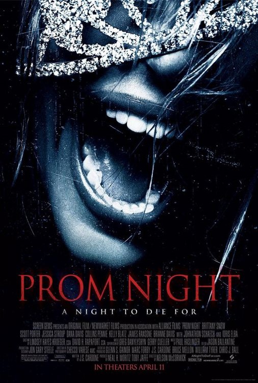
POSTER NAME: Prom Night RELEASE DATE: June 2008 DIRECTOR: Nelson McCormick PRODUCTION COMPANY: Original Film CAST: Brittany Snow as Donna Keppel, Jessica Stroup as Claire, Johnathon Schaech as Richard Fenton, Scott Porter as Bobby and Dana Davis as Lisa Hines. SYNOPSIS: A high school teacher is sent to prison due to murdering the family of student Donna in a sick attempt to force a relationship with her. Years later on the night of Donna's Prom she comes face to face with the killer. |
DENOTATION: This poster displays an image of a girl screaming with a crown falling over her face, the shot is a close up shot. The crown relates to the title 'PROM NIGHT' which is written below the main image. The tagline is below the masthead.
MIS-EN-SCENE:
LIGHTING: The lighting is light around the girl's face and crown however it is darker everywhere else, this signifies the importance of the girl.
NVC: The girl is screaming in the image, this connotes fear and danger. This works well with the genre of Thriller.
PROPS: The girl is wearing a crown that is falling over her face, this supports the title of the film ‘PROM NIGHT’ as she is clearly the prom queen. This connotes rapid movement, she could be running or have been hit. In addition to movement it can also connote frightfulness.
CAMERA ANGLE: This shot is a close up shot showing the NVC of the girl on the main image. This shot creates a terrifying feeling as this image stresses terror.
FOCUS: The focus in this image is harsh. The harshness supports the image used because the main image has scratches on
it and the image used shows the reaction of a scared girl.
COLOUR: The colours used are deep blue, black and red. The colour deep blue connotes depth, the colour black can connote death/fear of the unknown and the colour red connotes blood/passion. This works well for the poster as all those representations support the genre of thriller.
ANCHORAGE: The title ‘PROM NIGHT’ supports the image, this is because the image shows a girl with a crown falling over her eyes implying that she was the prom queen. The tagline ‘A NIGHT TO DIE FOR’ is an ironic way of stressing death at prom.
CONVENTIONS: This poster follows the conventions of a common thriller poster as it shows an intense image of the protagonist. The masthead and tagline are written in sans serif fonts, this creates a modern feel. 'PROM NIGHT' is written in capital red writing. The tagline 'A NIGHT TO DIE FOR' is written in white capital writing.
MOOD: This poster creates a sympathetic feeling as the viewer may feel sorry for the girl on the main image as she appears to be afraid. Her NVC connotes that she is hopeless which conveys a curious feeling as the viewer may wonder why she is screaming.
TAGLINE:'A NIGHT TO DIE FOR' is an interesting tagline as it is a saying used to describe an amazing night. In this instance death actually occurs at prom, this use of irony is effective because it has humour.
TARGET AUDIENCE: This film is targeted at teenagers, this is because teenagers have school proms and are a similar age to the characters in the film. This may cause viewers to relate to the film.

|

|

MAGAZINES

|
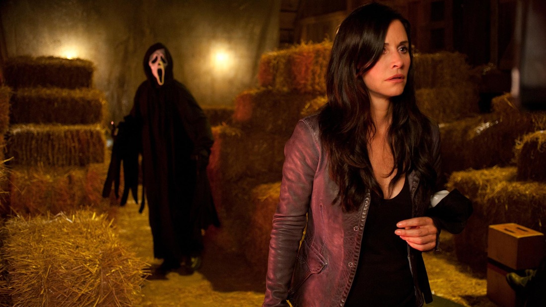
FILM TITLE: Scream 4 RELEASE DATE: April 2011 DIRECTOR: Wes Craven GENRE: Slasher CAST: Neve Campbell as Sidney Prescott, Courtney Cox as Gale Weathers, Wes Craven as the Coroner and Emma Roberts as Jill Kessler. SYNOPSIS: Sidney Prescott an author of a self help book based on the trauma of the killings by Ghostface Killer returns to Woodsboro for her book tour. During her time at Woodsboro she reconnects with her old friends Gale Weathers and Sheriff Dewey. Her return also causes Ghostface Killer to return putting her and everyone else at risk. |
DENOTATION: This poster shows Ghostface holding his famous signature weapon. The title is behind his head and there are two coverlines. The magazine also has many features on the left side of the page.
MIS-EN-SCENE
NVC: Ghostface is holding a knife and pointing it towards someone creating a 3D effect. This connotes violence. Also it implies that this antagonist is a serial killer. In addition to this, his body language looks relaxed, this implies that Ghostface is not new to killing people, this connotes that he is sadistic.
COSTUME: Ghostface is wearing a mask which has a ghostly facial expression, this connotes fear of the unknown as you cannot see the real antagonist. In addition to fear of the unknown the creepy facial expression represents terror.
PROPS: Ghostface is holding a sharp knife, this represents gore and death. The knife is Ghostface's signature weapon as he kills all of his victims with his knife.
CAMERA ANGLE: This shot is a low angle. This shot makes it look like Ghostface is standing over the viewer of this magazine which connotes that he is superior.
LAYOUT: The main image is on the right, the masthead is placed slightly behind Ghostface’s head with features and barcodes going down the left side of the page. Furthermore the conventions are on the bottom left of the page. This creates an asymmetrical layout.
MASTHEAD: The masthead is written in black capital letters with white outlining. This makes it distinctive and bold. Despite the masthead being placed behind Ghostface's head it still looks effective. This masthead is specially designed to appear slightly transverse rather than straight.
DATELINE: The date of the magazine is March/April 2011.
MAIN IMAGE: The main image is of Ghostface, he is placed on the right side of the page. He does not take up the entire page however he is still the first thing that you see when looking at this magazine.
COVERLINES: The coverlines are positioned at the bottom, left side and top of the page, this does not take away attention from the main image. The coverlines that are based on Ghostface is written in white and red, this can connote the innocence and the blood of the innocent. The colours of the coverlines work well with the colourfulness of the magazine. The other coverlines that are on the left and top of the page are the features of the magazine.
SELLING LINE: ‘The horror fans magazine'. This is simple yet effective as it appeals to a national audience.
BARCODE: The barcode is on the bottom left side of the page, this does not obscure the main image.
TARGET AUDIENCE: The target audience of this film would be teenagers who are easily amused or frightened, this is because this film is humorous as well as creepy.

|
|

|
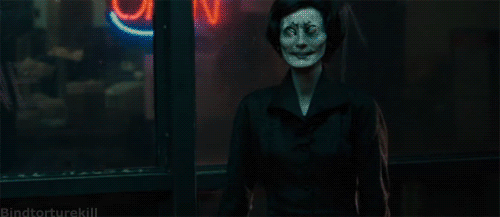
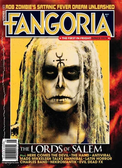
FILM TITLE: The Lords of Salem RELEASE DATE: April 2013 DIRECTOR: Rob Zombie GENRE: Thriller CAST: Sheri Moon Zombie as Heidi Hawthorne, Jeff Daniel Phillips as Herman Whitey Salvador, Meg Foster as Margaret Morgan, Bruce Davison as Francis Matthias and Dee Wallace as Sonny. SYNOPSIS: After playing a mysterious record from a music group called ‘The Lords’ radio DJ Heidi Hawthorne is plagued with nightmarish visions of vengeful witches. |
DENOTATION: This magazine shows a ghostly female looking directly at the viewer of the magazine with face paint, the masthead is above her head and the coverlines are at the bottom of the page.
MIS-EN-SCENE
LIGHTING: The lighting of the image is light, almost white. This causes the character on the main image to look pale almost deceased.
NVC: The girl has a blank facial expression, she is looking directly at the viewer this connotes that she is emotionless. Her passionless facial expression represents her as the antagonist.
COSTUME: She is wearing white face paint all over her face and black paint on her forehead, eyes, nose and mouth. This can connote evil and cold-bloodedness. The long dreadlocks also adds bizarreness to this character. The dreadlocks can connote spirituality causing her to look more peculiar.
CAMERA ANGLE: The camera angle is a close up showing her facial expression.
LAYOUT: The layout of this page is symmetrical as the main image is directly in the middle, the title and tagline are above the image and the barcode and conventions are on the bottom of the magazine cover.
MASTHEAD: The masthead is placed above the antagonists head, the colours blue and yellow make it look effective as the colours on the cover do not clash. ‘FANGORIA’ is written in capital letters and the font is modern making the masthead look bold.
COVERLINES: The coverlines are positioned on the top and bottom of the page, they are written in capital letters and the font is yellow. This does not obscure the main image yet is effective and visible.
BARCODE: The barcode is on the bottom left of the page. This is effective as it is visible and still out of the way of the main image.
TARGET AUDIENCE: This would be targeted at anyone who is into strange hair-raising films. Stereotypically, this would mostly be teenagers.

|

|

|
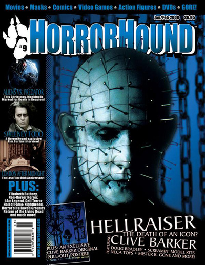
FILM TITLE: Hellraiser RELEASE DATE: September 1987 DIRECTOR: Clive Barker GENRE: Slasher CAST: Doug Bradley as Pinhead, Nicholas Vince as Chatterer, Ashley Laurence as Kristy Cotton, Simon Bamford as Butterball Cenobite and Grace Kirby as Female Cenobite. SYNOPSIS: Frank opens a portal to hell when he plays with a box he bought abroad. This causes gruesome beings called ‘cenobites’ to tear Franks body apart. Frank's brother and wife move into his old home and bring what is left of him back to life. Frank convinces his wife Julia to lure men into his home so he can use their blood to reconstruct himself. |
DENOTATION: This magazine shows Pinhead looking down, the setting of the image is not visible, the masthead is above his head, there are conventions on the top and bottom of the page also there are some features on the left side of the page.
MIS-EN-SCENE
LIGHTING: The lighting is light only on one side of Pinheads face, the other side is hardly visible and black. This causes a dramatic effect causing Pinhead to look mysterious.
NVC: The characters facial expression looks like he is depressed. Despite clearly being the antagonist, his NVC can connote that he is emotional. He appears to be looking down, this connotes superiority as he is standing above what he is looking at.
SETTING: The setting is not clearly shown in this image however there are chains hanging from above in the background, this connotes that he may be high up. Most likely in a building.
PROPS: Pinhead has pins coming out of his face and head. This peculiar look causes him to look evil portraying him as the antagonist. Also the pins can cause the audience to sympathise with Pinhead as his NVC represents him as gloomy.
CAMERA ANGLE: This shot is a close up, this is effective because it is showing his facial expression and the pins clearly.
LAYOUT: The layout if the magazine is asymmetrical as the main image is on the right side of the page, the masthead and some of the conventions are above Pinheads head, there are features on the left along with the barcode. Also the main conventions are on the bottom right side of the page.
MASTHEAD: The masthead is slightly behind and above Pinheads head. ‘HORRORHOUND’ mastheads are unique as they are always one colour with white outlining and a black shadow. In this case the masthead is blue with white outlining. This is bold and eye-catching giving the title a 3D look. The masthead is always slightly transverse making it distinctive from other magazines.
COVERLINES: The main coverlines on this magazine are written in white capital letters, they are placed at the bottom of the page which does not affect the main image in any way. The text looks effective and old fashioned. This supports the year the film was released which was 1987.
TARGET AUDIENCE: This would be targeted at slasher fans, this is because the film is gory. As well as slasher fans, the film is targeted at horror fans in general. This is because the story of the movie in spine-chilling.
|
|
TRAILERS
|
|
FILM TITLE: The Devil Inside
RELEASE DATE: March 2012 DIRECTOR: William Brent Bell PRODUCTION COMPANY: Paramount Pictures SUB-GENRE: Supernatural. CAST: Fernanda Andrade as Isabella Rossi, Simon Quarterman as Father Ben Rawlings, Suzan Crowley as Maria Rossi and Evan Helmuth as Father David Keane. SYNOPSIS: Twenty years after Maria Rossi was convicted with murdering three people, her daughter Isabella Rossi seeks to find out the truth about what really happened. She travels to Italy where Maria is locked up in a mental home where she attempts to discover whether she is mentally ill or possessed. |
MIS-EN-SCENE:
SETTING: The film is set in Rome, this works well with the genre of Supernatural as Rome is a religious city known for its Catholic roots.
COSTUME: The antagonist in this film is often seen wearing layers and ragged clothing, this can connote old age. This supports the idea that she is insane.
SOUND: The film begins with score which is played mostly throughout the trailer, the music composed for this film sounds fierce creating a tense feeling as it gives the listener a feeling that something terrifying may happen. Foley sound effects are also used for the bones cracking during the exorcism, this is effective as it creates a petrifying effect.
NARRATIVE: The story is told in a documentary style chronologically showing the events in the film. This is effective as this film is claimed to be based on a true story. This causes the audience to view the film as more realistic.
LOCATION: The film is located in Rome, this is revealed in the trailer by Isabella (Fernanda). This is also supported by a wide angle showing Isabella clearly walking the streets of Rome.
CHARACTERS: Maria Rossi (Suzan Crowley) is portrayed as the antagonist in the film, this is represented in the trailer as Isabella states that she has murdered 3 people during her exorcism. This implies that she was possessed, this supports the sub-genre of Supernatural.
THEME: Possession.
PACE: The pace of the trailer is fairly slow throughout, however at 1:16 when Maria screams the pace speeds up a little. This has an impact on the trailer because as soon as the scary part in the trailer is revealed everything appears more exciting. The speed in the trailer creates an intense mood.
EDITING: The trailer consists of many cuts, some showing the same setting, this connotes that there are many things going on in the film, this supports the genre of Possession.
TARGET AUDIENCE: This film is targeted at anyone who is a horror fan, also it can be targeted people who are interested in true stories and possession.
|
|
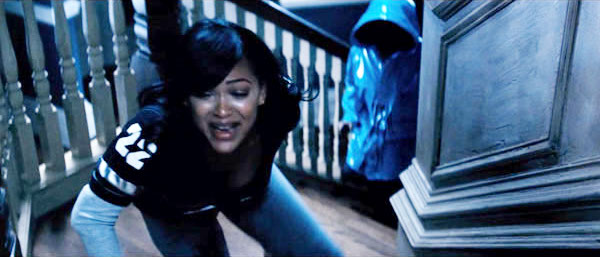
FILM TITLE: The Purge
RELEASE DATE: May 2013 DIRECTOR: James DeMonaco PRODUCTION COMPANY: Universal Studios SUB-GENRE: Thriller CAST: Ethan Hawke as James Sandin, Lena Headey as Mary Sandin, Adelaide Kane as Zoey Sandin and Max Burkholder as Charlie Sandin. SYNOPSIS: The American government sanctions an annual twelve hour period where ALL crime is legal. The Sandin family are put in an ultimate situation when an intruder drags the outside world outside their home. |
MIS-EN-SCENE:
NVC: In this trailer Mary is represented as worried, there is a shot of her covering her mouth in fear. Furthermore there are scenes where she is clearly scared for her life. This connotes intimidation.
NARRATIVE: This trailer is presented in nonlinear order, informing the viewers about what the purge actually is and still not giving too much information away.
CHARACTER: The antagonists in the film are clearly presented as they are wearing masks and terrorising James and Mary Sandin. James and Mary Sandin are portrayed as the protagonists as they are seen trying to get away from the masked people on bikes, this connotes innocence.
THEME: Gore
PACE: The pace of this trailer is fast, creating an overwhelming feeling for the viewer. This has an impact on the trailer as it makes the film appear exciting and full of action.
EDITING: This trailer is consistent with quick cuts building tension, this is effective as it keeps the viewer interested and eager to see the film. The quick cuts create an exciting feeling which can represent the film overall.
SOUND: The beginning of the trailer has an upbeat score playing. After this the score played is stimulating music. This can connote the day before the Purge and the day of Purge.
CAMERA: Many wide shots are used in this trailer, this can be used to set the scene of the film. Furthermore a wide angles show body language which is effective in a thriller film.
TARGET AUDIENCE: This film is targeted at action driven horror fans. This is because the film will have viewers on edge.
|
|
FILM TITLE: Quarantine
RELEASE DATE: November 2008 DIRECTOR: John Erick Dowdle PRODUCTION COMPANY: Screen Gems SUB-GENRE: Thriller CAST: Jennifer Carpenter as Angela Vidal, Jay Hernandez as Jake, Columbus Short as Danny Wilensky, and Steve Harris and Scott Percival. SYNOPSIS: Reporter Angela and her cameraman Scott are covering a story for a reality programme on night shift Firefighters. A call takes them to an apartment building in Los Angeles where police are investigating reports of screams. Little do they know that attacks are in and surrounding the building |
MIS-EN-SCENE:
LIGHTING: The trailer is filmed mostly using a green filter, this is effective as it looks like a horror documentary. The parts of the trailer that were not filmed with a green filter have really dark lighting with a flash of light on where the camera was positioned. The connotes authenticity.
NARRATIVE: The story is told in a voice over style, the tone of the voice is serious creating a harsh effect making
the story seem realistic. The trailer is presented in chronological order showing the middle and end of the film. This is effective as the storyline begins to unravel as you view the trailer.
LOCATION: The film is mostly located at the apartment building where most of the action takes place, this is shown in the trailer when Angela (Jennifer Carpenter) is reporting outside the location.
CHARACTERS: Angela is portrayed as the protagonist, this is shown in the trailer as she is the most fearful, her NVC shows that she is running and panicking due to the sight and thought of the antagonist.
THEME: Fear of the unknown.
PACE: The pace of the trailer is fairly slow until the antagonist is shown, the speed in the trailer connotes that the film is thrilling which puts the viewers on the edge of their seats.
EDITING: Many quick cuts are used in the trailer, this also creates an exciting feeling as it causes the viewer to believe that there is lots of action in the film. Also it is an effective way of making the film seem intense for the audience.
SOUND: Background sound effects are used throughout the trailer, this represents the film as lively. This also connotes that the film is dynamic as many things are going on. Furthermore design sound effects are used to create a deep thrilling effect.
CAMERA: The camera angle used in this film are mostly handheld, causing the film to look more realistic and like a documentary. This supports the synopsis as they are filming for a reality programme.
TARGET AUDIENCE: This film is targeted at anyone who enjoys watching documentary styled films or documentaries overall also the film is targeted at thriller fans.
