In what ways does your media production use, develop or challenge forms & conventions of real media products

Conventions are used to help conveny what type of product is it to the audience. They are as et of rules/ guidelines that have been created over time. We followed these conventions when it came to creating our trailer, poster and magazine cover.
During Question One of the evaluation is it important that we compare and contrast between our media products and the real media text as a way of highlighting our point and back it up. |
This question is about how all the media products we have generated follow the conventions in order to be successful. Heere we will analyse our Trailer, Poster and magazine thoroughly in order to highlight the conventions of each one furthermore we will back up the use of of this using the real media text.
|

|
|
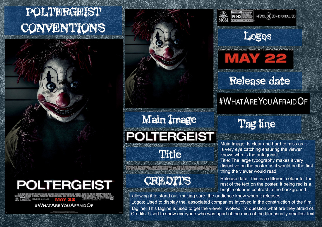
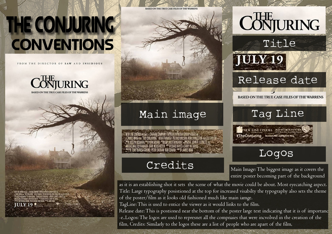
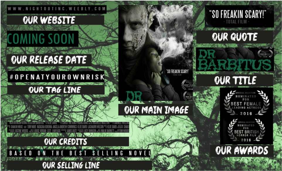
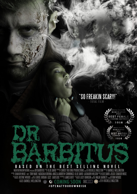
Above is the diagram for our Poster it highlights the conventions that we have followed. It is separated into sections to show how we have followed it. In the similar way the Poltergeist poster is laid out our Dr Barbitus poster has a similar structure. In a similar way to the Conjuring poster and Poltergeist poster the main image takes up the majority of it as it becomes part of the background. There are other similarities such as the large main coverline that is very distinctive displacing the movie name.
We desaturated the image image of the poster in order for
|

|
|
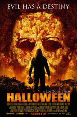
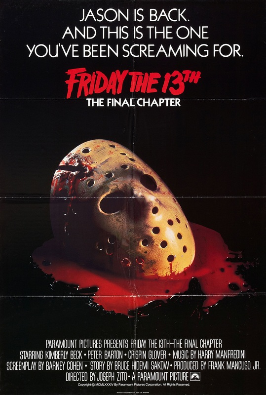
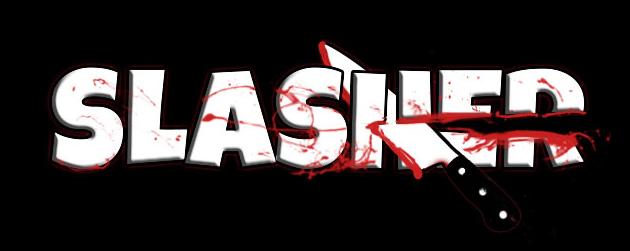
Our chosen sub genre is slasher looking at previous posters within this genre. As we looked previous text within this sub genre we came to a conclusion that the posters are usually very graphical and some are simplistic like the "Halloween" The slasher genre feature iconic phallic weapons on the posters allowing the viewer to clearly identify what it is. Using google allowed me us to look at various types of slasher posters this expanded our knowledge of the conventions.
|
conventions followed
credits & release date near the bottom of the poster

|

|

|
Much like the media text that we have looked at the credits are placed at the bottom of the poster. This influenced our decision that it is appropriate for them to go at the bottom. The credits are generally small but still legible. We also decided to include the convention of having a quote on the poster much "Drag met to hell" (released in September 2009 directed by Sam Raimi) and "Eden Lake" (released September 2008 directed by David Julyan) both have quotes used on the posters. We adopted this as it would be a good way to get the viewer engaged with the quote especially if it is from a well known critic as people will be more willing to watch it. WHat made us go for a greyscale theme is because as we looked at various other posters in this genre the majority have are dimly lit.
Lastly the conventin we followed as the release date as it is near the bottom of the poster and mich like other posters the typography is pof a diffferent colour to the credits to ensure that it stood out.
Lastly the conventin we followed as the release date as it is near the bottom of the poster and mich like other posters the typography is pof a diffferent colour to the credits to ensure that it stood out.
film title the largest text
|
|
|
Here are two examples of where the film title is the largest text on the poster in real media text the reason why we followed when making the poster was by having the film title as the largest text as well as it being positioned near the bottom of the poster.What convinced us to make this decision was that it would be clearly recongiseable with the audience as thye would know the name of the film straight away it.
On the Halloween poster the text used in the film title is of the same/similar to the colour of the main image. This style continuity is also done in our Dr Barbitus Poster
On the Halloween poster the text used in the film title is of the same/similar to the colour of the main image. This style continuity is also done in our Dr Barbitus Poster
selling line

|

|

|
We felt that positioning the selling line below the title would be most logical as the viewer would be drawn to the title as it is the biggest font on the page then read the tagline below once they know the name of the film this convention would get the viewer intrigued. When looking at real media text we discovered that not all posters used the a selling line. Above are two other examples of this "The silence of lambs" and "The Amityville horror".
quotes used
|

|

|
We also decided the convention of having a quote on the poster. It would allow the viewer to know what other thought so maybe they would feel more generous to watch it to see if they felt the same way.
conventions challenged/developed
film title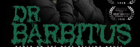
release date
|
The conventions that we have challenged/ developed was by having awards featured on the poster as well. This would be considered as challenging the conventions of poster of this genre is because we don't see that many posters with this feature on it.
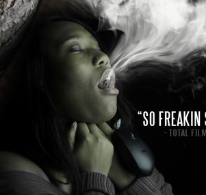
A convention that we have considered as developed it creating continuity between the release date as the title of the film" Dr Barbitus" as they both used the same colour the reader would interpret that as these are the two most important information on the poster. Another convention that we challenged would be that a lot of poster within the sub genre what we based on majority feature weapons to inflict pain upon the victim however, our poster we use a computer mouse wrapped around the victims neck this is a subverted connotation of a mouse as they are usually not seen as an object to inflict pain rather than one that is used with computers. This is a nice twist as the nose links to the sub text of what the film is about as mouse could represent how bullying and teenagers in this generation addicted to technology can lead to death also it could be interpreted as something normal could be turning into a weapon. |
weapon convention challenged
|

|
|
A convention that we have challenged and developed would be the combination of images used in the poster. It shows are developed of photoshop skills as we were able to import our antagonist into the background as a mid shot being used and having our victim in the foreground this could connote voyeurism furthermore, it shows are creative aspect as we were able to impose the image of bullies into the smoke coming out the victim's mouth as it is opened to interpretation that the reason why she is suffer is because of them. This could link the theorist Steve Neale 1980 about familiarity with innovation. It shows all the majority of the characters involved in the film giving the viewer and understanding of who's involved.

|

|
Masthead:The masthead is the largest font on the magazine even though the masthead is positioned behind the main subejct it is still readable /recognizable as "Empire". The typography is simplistic yet very eye catching due to its size.
Main coverline: The main cover line much like the masthead of the magazine features a simple typography however it is canted this would be more interesting/ eye catching because it isn't the norm in terms of how cover lines are laid out on the page.
Coverlines: In comparison to other magazine there aren't that many coverlines.
Colour scheme: The colour scheme green, purple, black and white are effective as the main image as well it goes/ compliments to main image as the subject is wearing similar colours
Barcode: here the barcode is below the masthead it is placed here so that it is clearly viable for when the it comes to purchasing the magazine.
Date and Price: Thae date and price follow the colour scheme as they are white with a black stroke, they are relatively small in size compared to other text on the magazine
|
|
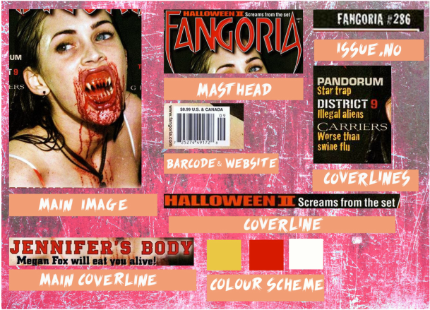
Masthead:this magazine follows the convention of the masthead being one of the biggest font as well as being at the top of the page. However in comparison to the Empire magazine above the Fangore masthead is in front of the main subject/image
Main cover line: The main cover line "Jennifer's body" a bold typography is used with a faint stroke around it the the text has some sort of white tethering behind it make it stand out more
Main: The main image is a mid shot of the subject the image is very eye catching as it takes up majority of the page.
Cover lines: The coverlines are of a different size and follow the colour scheme.
Colour scheme: This colour scheme is mainly red as it carries it connotations as well as being eye catching.
Barcode, Price & date: These are small hover are important as it shows us what's the date of the magazine as well as the price.
|
|
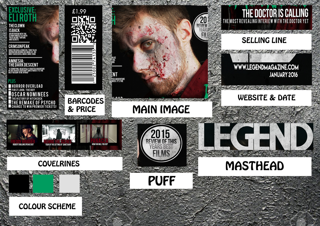
Masthead:The masthead in our magazine is positioned at the top of the page. We used a very large font to grab the viewers attention.
Main cover line: The main cover line on our magazine is large the text used it bold catching the viewers eye and it clearly legible. We developed the masthead by using a texture and overlaying it on the masthead by using photoshop, this is effective as it gives it character.
Coverlines: The coverlines are aligned formally and are of a similar typography and colour this makes the magazine look professional as the viewwer would be more willing to watching the film as the magazine portrays it well.
Colour scheme: The colour scheme is clearly evident on the magazine showing that we have understood what the purpose of a colour scheme.
Barcode price & date:
Date and Price: The is placed below the website address near the masthead of the magazine.The price is abovwe the barcode these are next to each other as the price of magazine links to barcode which would be scanned.
Puff:We decided to follow the convention of having a puff as it would break up the page a bit as it wouldnt just consist of coverlines. The puff is an effective way of catching the viewers attention as we believe "2015 Review of this years best films" is something that would draw the viewer into the magazine.
Website:The website convention is a nice addition as it would give the viewer an opportunity to find out more.

|

|

|
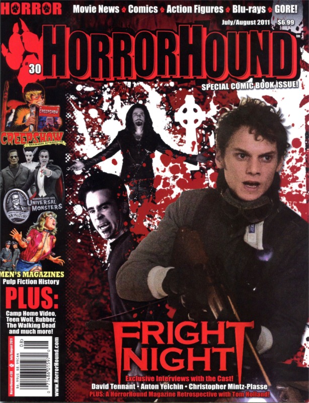
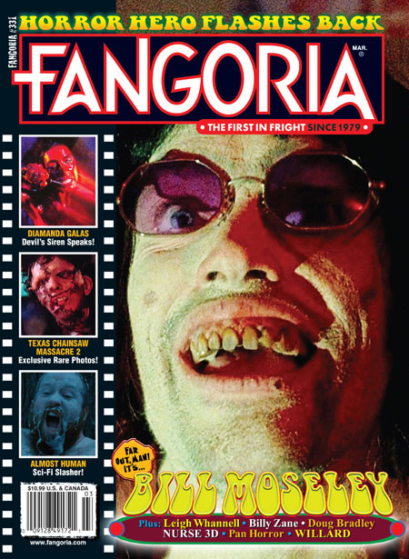
To the right are examples of horror magazines that we have looked at. Much like our magazine they have a relatively large masthead positioned at the top of the magazine. We felt that this convention has a huge impact on a magazine and how it is seen by the audience.
|
To ensure that the viewers knew that the poster and magazine were created from our production company which is Nightoutinc. We decided to use the same colour and typography for the main coverline making it look professional. This would make them look more uniform allowing the audience to kw that the poster and magazine is about the same film.It is important that we have showed continuity across are work as it portray us in a professional way and that we understand what the roles of a Production company when it comes to creating these type of media text
conventions followed
|
Another conventions we decided to follow was the masthead as we agreed that it is most appropriate for it to be at the top of the magazine as well as being the larger font. We developed on the puff by having a grain/texture on it to give the magazine some character.
Another convention we followed was by having cover lines with other images we decided to have this as it would invite people to our magazine more as they would have a glimpse of what it contains |
|

|
website convention
|
|
|
Here we decided to follow the convention of having the Night Out Inc website on the front page of the magazine. From looking at real media text magazines that used this convention we felt that it would be beneficial especially in today's generation due to the proliferation of hardware and digital convergence people have more access to the internet and the percentage of smartphone users has increased meaning people will be able to see the website link on the magazine and access it with ease.
Cover Lines with images

|

|

|
On our horror magazine we decided to follow the convention of having coverlines with images as it would be more engaging for the viewer as they would not just be able to read the coverline but see an image in relation to it all from the front page of the magazine. If the audience see something they like they would be more incline to purchase/read the magazine. Here are two real media text examples of image coverlines are being featured on the front page of horror magazines.
conventions challenged/ developed
A the top of the magazine it says inside, this shows that we have developed because it would keep the viewer understand what is inside of the magazine.
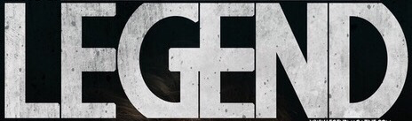
We would also consider that we have developed the convention of a masthead as we have applied some texture to it this shows are skills with photoshop and being able to use it's functions/features to enchanted our work. The combination of the colour and texture of the masthead makes it looks solid this is effective as it is reinforce by the size of the masthead and texted used. Below is an image that was used to create the texture on the masthead.
Another convention that we challenged would be the title of magazine as when looking at real media text the main coverline is usually all on one line, however we have opted for a different route.
|
|
When looking at the Smiley trailer below we noticed how the conventions of a trailer were intergrated into it and how in the horror genre it is used to frighten/scare the audience fast and slow shots are used to create dramatic scenes within the trailer and contribute the purpose of making audiences panic. The conventions of a trailers are the use of lighting, Costumes, Props, Setting, Editing, Music, Sound effects, Pacing, Characters, Length, Tension/suspense, Storyline, Plot, Composition, Camera techniques. All these conventions are equally important when creating a trailer.
conventions followed
Smiley production name
smiley captions
smiley title
smiley credits
|
our production name
our captions
Our title
our credits
|


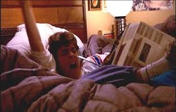
length
Another convention that we followed would be length here we have looked at how long horror trailers are and felt that it would be suitable for our trailer to be of a similar length. The reason for having this length would also link to the other convention of a horror trailer creating a feeling of thrill, Tension and suspense as well creating pace that will keeping the viewer engaged in the trailer.

Dr Barbitus

Smiley
|

The Pact

Love Molly
|
Another convention that we followed was the composition even though we didn't follow it exactly we were still able to give the trailer some pace when editing it in Premiere as the use of quick shots and cuts allowed us to do this. At the start of the railer we set the scene using establishing shots which would classified as the equilibrium the trailer then goes to scenes of drama/ increase in intensity showing the disequilibrium.
The other convention we followed is storyline to make sure that we didn't give the full Todorov of our film quick cuts allowed us to keep certain scenes to a minimum and nit expose what happens completely.
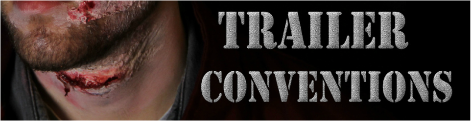
Lastly the convention we decided to follow when looking at our real media text is the credits being at the end of the trailer we decided to develop on it by having our company logo and website with the credits instead having more than one credit that appears on the screen also we added a smoke texture when creating the trailer in Adobe Premiere giving the credits more character than it being just black like in the Smiley trailer.
The other convention we followed is storyline to make sure that we didn't give the full Todorov of our film quick cuts allowed us to keep certain scenes to a minimum and nit expose what happens completely.
Lastly the convention we decided to follow when looking at our real media text is the credits being at the end of the trailer we decided to develop on it by having our company logo and website with the credits instead having more than one credit that appears on the screen also we added a smoke texture when creating the trailer in Adobe Premiere giving the credits more character than it being just black like in the Smiley trailer.
camera TECHNIQUES
Here are a few examples of camera techniques that are also used in the real media text as well as are trailer this highlights the conventions that we have followed.
over the shoulder shot |
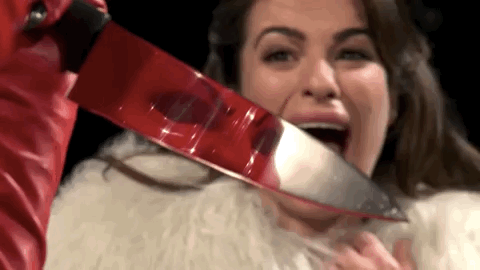
Weapon close up |
|

|


Reaction shots |
Tracking shots |

|

|

|

|

|

|

|

|
The conjuring
|
|
NLighting: The use of lighting is dim this would contribute the theme of the movie as well as the location as a part of setting the scene.
Costumes:The victims are dressed in casual/normal clothes representing an ordinary life about a family living in a house. This would be considered more realistic and believable towards the audience. Props: Phallic weapons are kept to a minimum as we see only household objects being used. Setting: The trailer clearly shows that it is set in an ordinary house which creates a very down to earth and realistic vibe. Editing:The cross cutting and quick cuts create suspense as the viewer cannot see the whole seen to know what exactly is happening. Music: Normal joyful music is used at the start to show the equilibrium.Silence and echoing is used to create suspense and thrill. Sound effects: Manipulation of children's voices creates an enigma as it confuses the viewer. Sound effects are also used to exaggerate scenes. Pacing: The pacing is at a normal speed at the beginning then beginings to speed up towards the end slightly. |
Characters: The characters used are children and a mother are represented as vulnerable, stereotype of women being weak and usually portrayed as the victim.Length:The length of the trailer is 2:33 minutes a relatively normal/average length for a trailer enough to intrigue the viewer without showing the whole plot.
Tension/suspense:There are scenes of silence where the victim is in a dark room these situations would create suspension as the audience would think something bad is going to happen to fullfill their expectations.
Story line: The antagonist the remains unknown throughout most of the trailer this creates an enigma for the viewer as they being to wonder who is the antagonist.
Composition: The composition of this trailer starts from a normal household establishing shots are used to show this and quickly things turn for the worst. This composition is effect as it shows the great contrast between the equilibrium and disequilbrium that the antagonist has caused.
Camera techniques:The trailer consists of a varied camera techniques from reaction shots panning and tracking, these camera techniques play a big role in the trailer and audience expectations.
SETTING

|

|
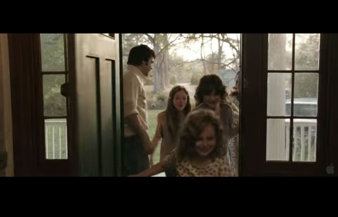
Much like the establishing shot used in the Conjuring trailer we have used one in our trailer to show the location unlike the Conjuring trailer we have decided to have the establishing shot at the start of the trailer as it would be one of the first things the audience would see.
costume
|
|
Here is an example of how we followed the convention of costume. ,Much like in the conjuring the people in our trailer are wearing normal generic clothing. The reason behind this it is show how normal everyday life could turn into a horrific event as it would show the dramatic change in contrast between the equilibrium and the disequibirum.
Music/sound effects
|
| ||||
Above is an example of a drone that we in our trailer as well a mp3 of the sound of our trailer. we used the convention of sound which also plays a part of pace, tension and suspense. We made sure that the sound gradually built up towards the disequilibrium as the pace of the trailer increases show how the intensity is increasing this was also reflected in the camera shots used as there were scenes of violence and people running frantically.
lighting

|
|
The lighting used in the media text is dim this is reflected similarly in my trailer.
conventions challenged/developed
The conventions that we have challenged when creating our i
When taking and establishing shot we have decided to develop this by having a panning establishing shot as it would allow the audience to see more of the location a better viewer and understand of where the trailer is set.
Another way of which we have developed the trailer is by adding a circuit board texture to the back of the Title caption on the trailer this shows how we have incorporated the digital aspect of our story line into the theme of our trailer.
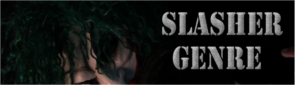
Our chosen sub genre for our concept is Slasher the reason why we chose this genre was because during our audience research our demographic voted most for the Dr Barbitus todorov which was a slasher sub genre as we wanted to meet our audiences expectations and needs we decided that it was best to anaylse and comprehensively understand the slasher genre must consist of in terms of key convetnions
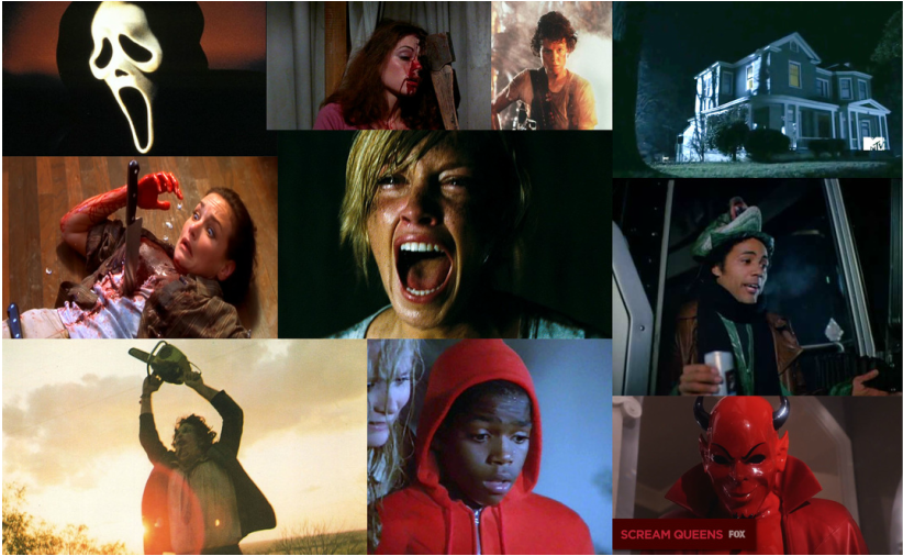
Slasher conventions
Below are some of the conventions that are associated with out sub genre of Slasher. It highlights how we have studied are sub genre and were able to reflect it within our film.
quiet suburban
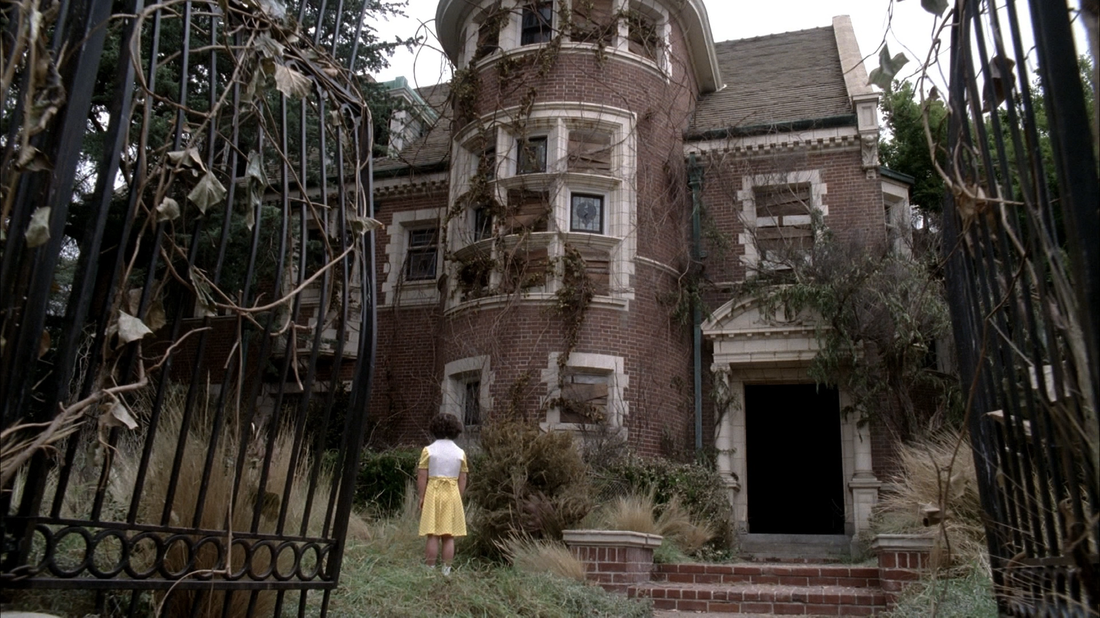
This is considered as a convention as the plots usually happen in dissolute environments far away from where lots of people are as very profound murders and villains seek victims. The locations are usually quiet it shows how a house which is considered to be safe can turn into something horrific.
dark/dim lighting
Another convention of slasher film is the use of lighting. The lighting is very effective as it adds tension to the scene as shadows are created making the audiences viewer of what it happening unclear.It is a psychological aspect playing with the viewers fears of the unknown.
colour
The colours red white and usually associated with a horror film of this sub genre. The reason why red is used in the theme if because the colour connotes pain and can be interpret as blood this is used to inflict fear onto the viewers. The colours black and as used as they contrast with each other as well as the allowing the red to stand out. Below are some examples of how these colour schemes are used in this sub genre.
|
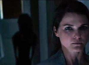
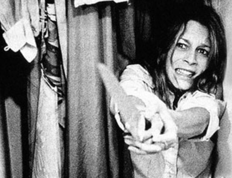
final girl
Final Girl which is Carol Glover theory this is described as a convention because the female who usually survives it the one who is smart and
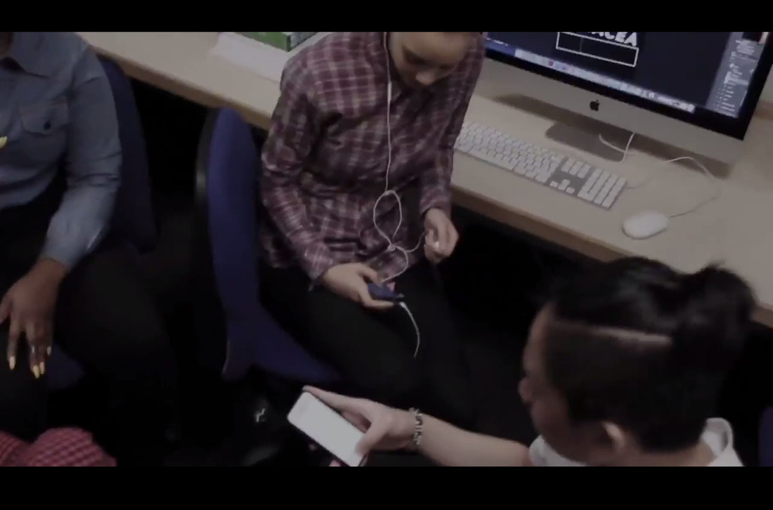
Young/adolescent victims
Youngsters are at the age of where they are usually mischievous this would result in them getting into trouble or coming across the antagonist easily. They are usually the first to die as they are punished for involving in activities such as drugs. in our film these activities would be bullying.
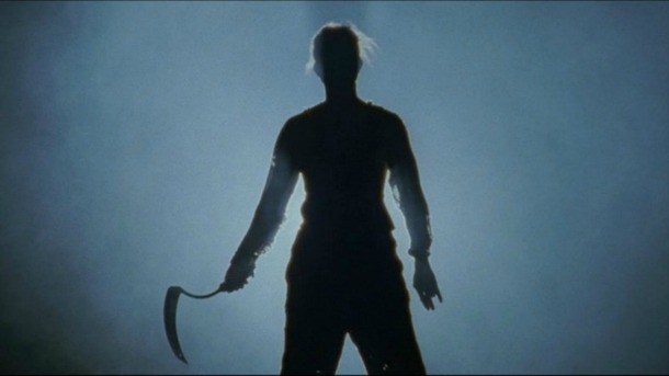
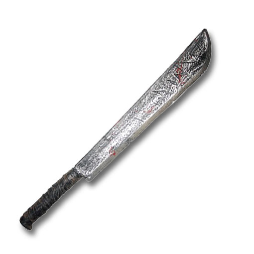
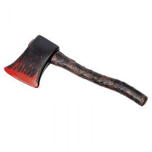
phallic weapons
Phallic weapons are another convention of s slasher film because they are used as iconic object within the film as it would connote death and pain which links to the sub genre as slasher are generally very
|


Horror genre
|
What is the horror genre? You may asked, Horror is designed to elicit a negative reaction amongst the audience by using their primal fears. The fears of what the audience is sacred of are usually exaggerated to create and uneasy and intense feeling of thrill for the audience to undertake.
Horror films are designed in this manor as it would fulfill the audiences expectations and needs and sometimes exceed them. Most successful horror films are ones that excel in these categories as well as being able to captivate and entertain the viewer also many successful horror films are the traditional/original ones were they were the first of their time and perceived to be radical as they were the first. |
Now due to success of horror films the genre has now expanded as their are a lot more genre and now even hybrid genres such as horror and comedy. This shows that the genre has opened up to larger audience as more people have become interested in it giving them a wider range of sub genres within the genre that they can find comfort in as it fulfill their needs. The Tv series Scream Queens is a good example of how the horror genre become a hybrid of other genres.
|
|
conventions followed/challenged
|
The Slasher conventions that we followed was...
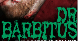
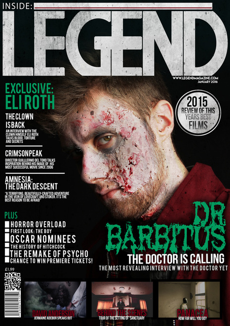
I would say we challenged the conventions of a slasher film by our use of colour as the traditional convention would consist of red, black and white however our film uses majority of the colour scheme of green, grey, white and black this shows our confidence within our sub-genre that we were able to think outside of the box when it comes to picking a colour scheme for the magazine and poster as well as the title caption on the trailer but where still able to convey the subgenre of it being a slasher effectively towards the audience. We consdiered this a challenged to the norm as we green wouldn't normally be the first colouyr associated with a film of this sub genre. |
colour scheme (challenged)

|

|

|
The green colour scheme is evident on the magazine and poster as it shows the continuity between the type of media products. On the right above the green theme is applied on the subject as there is a tint of green on the skin. This would also show how we have developed the colour scheme by having applied on the main image as well as the cover lines masthead etc.
here are examples of followed conventions
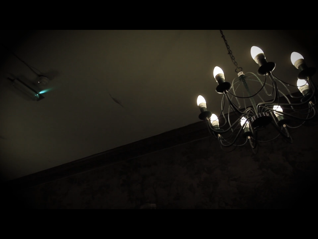
dim lighting

|

|

|
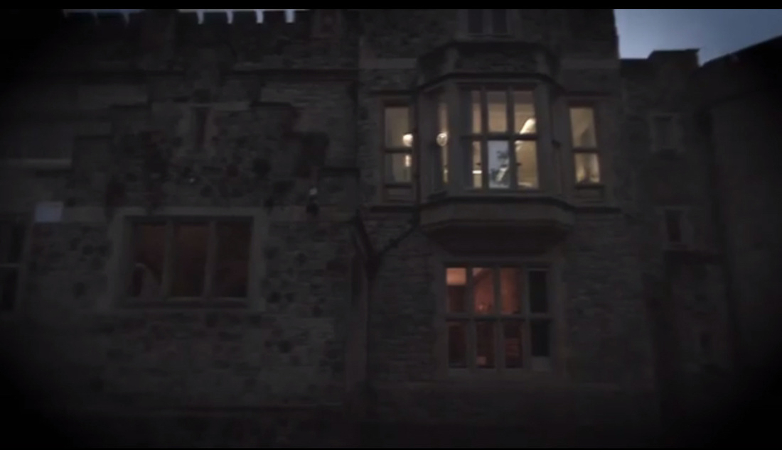
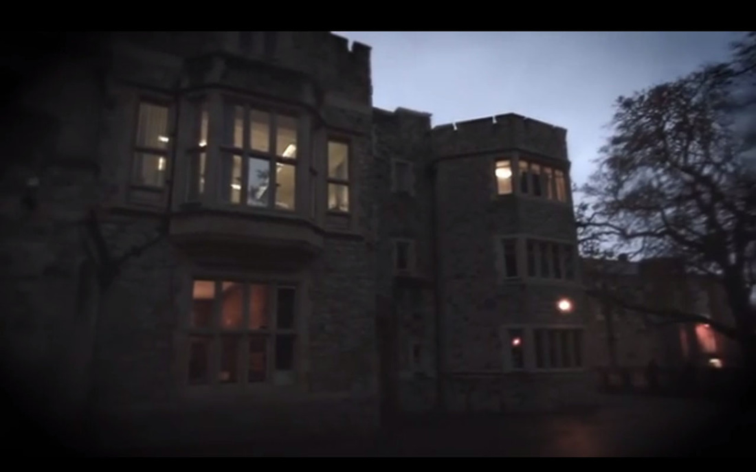
Here we have followed the convention of dim lighting since the location of which shot in was old fashion it would be most appropriate for us to use this lighting, furthermore the use of Adobe Premiere allowed us to enhance this convention.
yOUNG/ADOLESCENT VICTIMS

|

|

|
The reason why we followed the convention of using young adults as victims is because it would fit well with the sub text of our film as it would based around young adults/ teenagers.
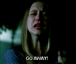
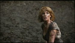
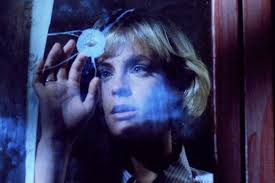
FINAL girl

|

|

|
Here scenes of our trailer where they may be considered as the final girl. On the right we see an image of a femnale who is running away as she is on her own this maybe considered that she is the survivor of what it happening.
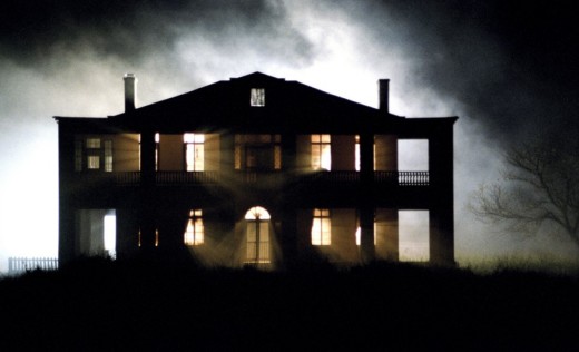
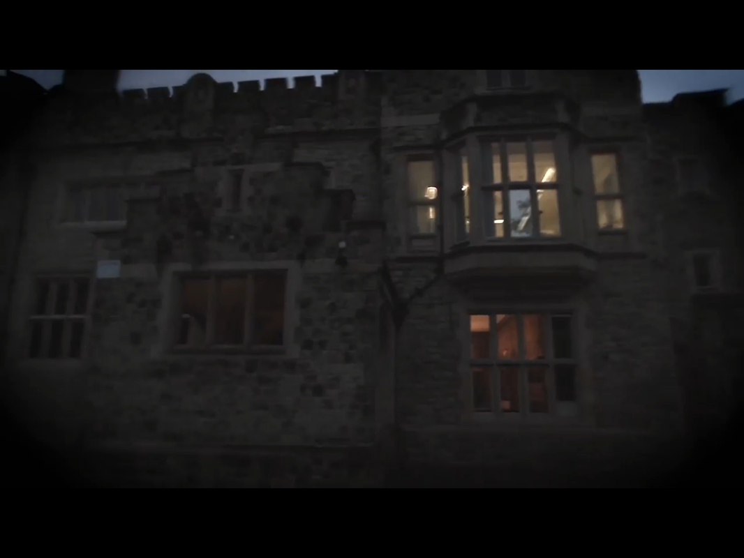
Quiet suburban setting
|
|
|
Here above are screenshots of our trailer as to how we followed the convention of having the film set in a suburban environment.
Conclusion