
How effective is the combination of your main product and ancillary texts?
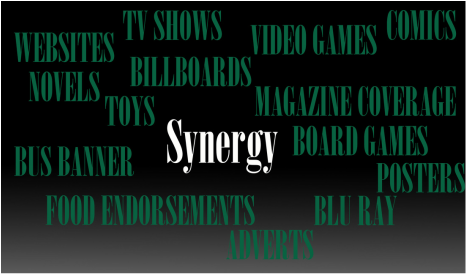
This question is asking us how we portray continuity within our trailer,poster and our magazine in order to create our brand identity. Brand identity is used by media establishments so that their audience can recognise their products as part of the same range. This means that they should be similar visually through the use of typography, colour, logos, composition, and visual style. with our brand we use different media platforms in order to promote our brand and this is done through media convergences and synergy. Media Convergences is two or more different media platforms work together to use an idea that can be promoted but that benefits all of them, all products are released at the same time, synergy is the simultaneous release of different products to boost both, Synergy works when different elements of companies promote each other. Cross media convergence is an important aspect because its two media companies collaborating for the purpose of generating profit (synergy). This is important in production because when two media conglomerates come together and they are very well known it will make the audience want to watch the film more
Examples of Synergy and cross media convergence
|
|
successful REAL MEDIA TEXT

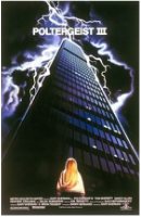
Poltergeist is a super natural horror trilogy and a remade film, although our sub genre isn't the same as poltergeist the films and its brand is shows great example of Synergy and Cross Media Convergence effectively. Poltergeist’s franchise is based on their film series which started off with original film which was directed by the famous Tobe Hooper and co-written and produced by Steven Spielberg. The film consisted of a trilogy that rained from 1982 to 1988. Years later, when you could say that you thought poltergeist was forgotten about, the remake of the original was due to be release in 2015 which it did and grossed $95.6 million in box office. A documentary film based on the mystery of the franchise entitled 'The Curse of Poltergeist' is set to begin shooting in November 2015, which again help the brand stay current.

|

|
|

|

|

|
All 6 Posters of Poltergeist Releases
|
|
|
|

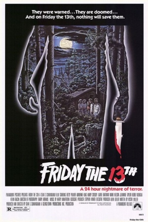
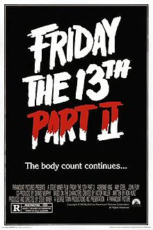
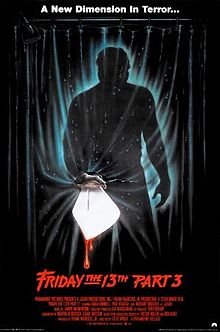
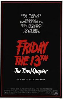
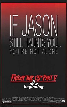
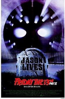
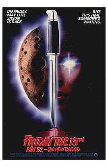
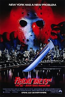
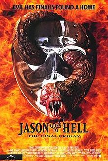
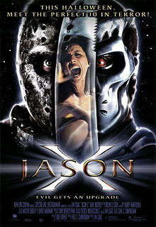
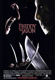
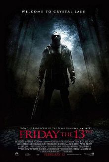
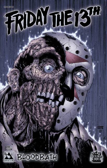
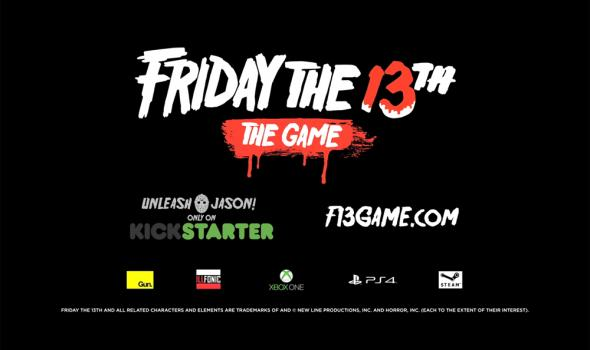
Friday the 13th is an American Horror Franchise, this franchise consists of 12 slasher horror films,Television show, novels, comic books and other tie merchandise. Friday the 13th happens to be the same sub genre as our franchise so it helps us when it comes to examples of franchise that have excellent skills within synergy and Cross Media Convergence to expand their brand and increase their product profit. Friday the 13th is considered one of the most successful media franchises in America ,not only for the success of the films, but also because of the extensive merchandising and repeated references to the series in popular culture.In addition to the films, television series, and various literature based on the Friday the 13th franchise, there are over 100 licensed products that have grossed more than $125 million in revenue.
|
|
|
|
|
|
|
|
|
|
|
|
All 12 of the film posters
|
|
|
|
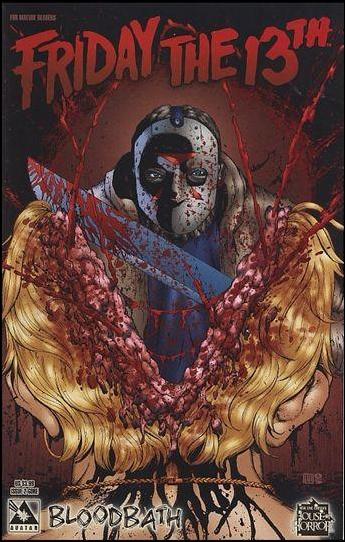
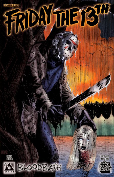
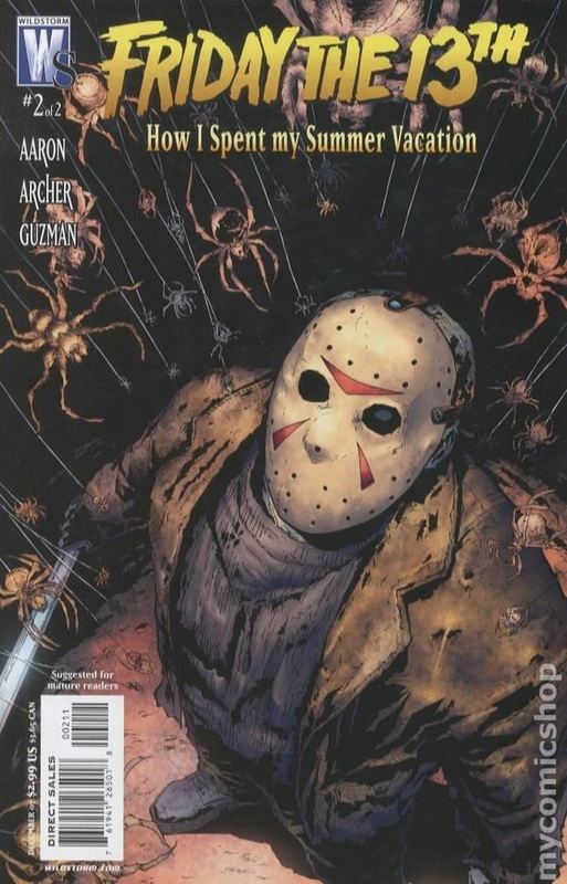
Friday the 13th novels & comics
Friday the 13th franchise didn't just limit themselves by doing series films they also went to do a series novel version of Six out of their twelve films; Friday the 13th part 1 & 2 written by Simon Hawke, Friday the 13th part 3 written by Michael Avallone, Jason Lives written by Simon Hawke, Jason X written by Pat Cadigan and Freddy Vs Jason which was written by Stephen Hand.

In 1994 four young adult novels came out under the Friday the 13th name which basically explore the insides of Jason following his story line into more detail which were all written by Eric Morse.
Here are some of the comics that Friday the 13th have published
|
|
|
|
|

Friday have defiantly pushed when it comes to the comic world the have been many issues in order to keep the Friday the 13th lovers interested, these comics also remain with in the continuity of that the brand is a horror franchise and show it through the graphic/ gory content. The franchise focuses on the character of Jason a lot and continues to create more plot and action around Jason. One of the fans favorites is the comic; Freddy Vs. Jason Vs. Ash, which is a crossover of the famous Freddy from nightmare on Elm Street and Ash from Evil Dead.
Friday the 13th Merchanise

|

|
|
|
|
The first Friday the 13th game that was released in 1986 for Amstrad CPC, Commodore 64, and ZX Spectrum which dominated in the mid 1980s in the computer market making their product accessible for most people, in 1989 LJN then developed a game for the Nintendo entertainment System again expanded their audience through different consoles within gaming, Nintendo was , at the time the game was release, and still is the best selling gaming console of its time. As time progress and technology developed, in the 2000s they developed a game under the Friday the 13th franchise what was accessible on mobile phones. After a long wait since the last release they announced in January 2015 that a new Friday the 13th game with be release in autumn of 2016 ans will be a multi platform game, meaning that it can be played on Xbox one,PC and PS4.
|
|
|
|
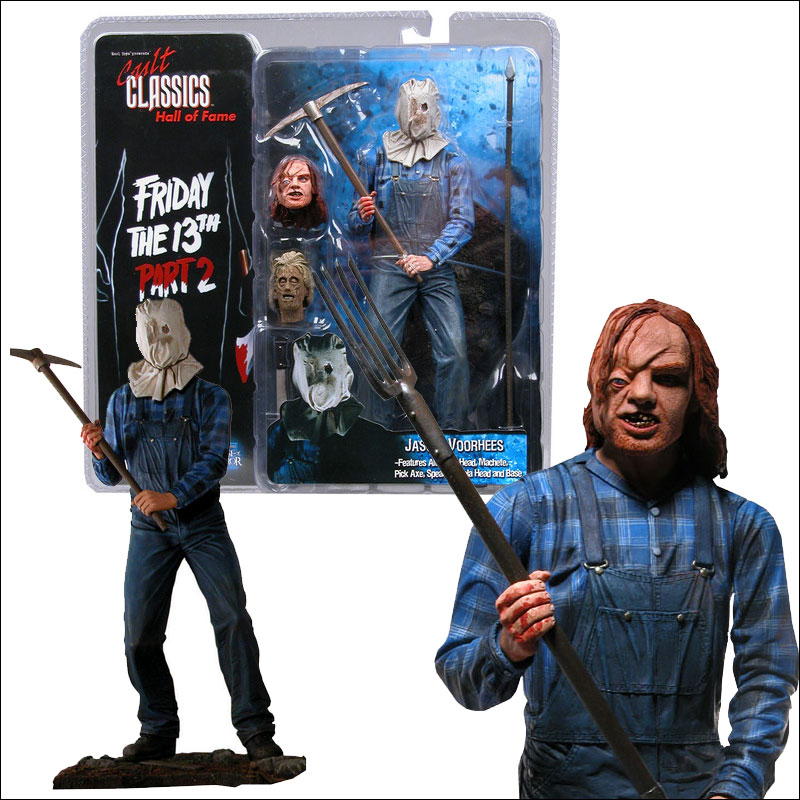
Friday the 13th don't just stop at virtual games within merchandise they also produced model kits and action figures of some of the characters from the twelve slasher films.Over the years, the characters of Friday the 13th have been marketed under various toy lines But of course the most popular release has always been the new releases of Jason.
|


a example of a franchise that uses continuity
|
|
|

|

|

|

|
ALICE - Antagonist
Characters
|
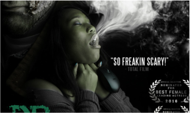
The poster features Angela in the poster as she plays one of the main characters in the film and the story follows Alice and her journey. She is also shown throughout the trailer giving basic information on what the story-line is and how it affects her character. We didn't put her in the magazine as we didn't want to give away too much and wanted a main image that was pretty dominant.
|
|
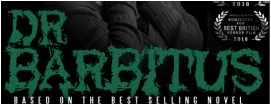
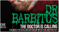
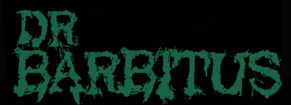
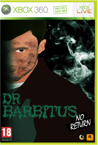
DR BARBITUS - Protegist
|
|
|
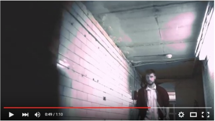
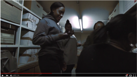
The first image is a screenshot of the antagonist from the trailer, what we did we didn't want to give away too much so we did a quick shot of him so that the audience could clearly see that it was the antagonist but not see his face clearly and we also position this shot at the end of the trailer similar to a build up. The second image is from the poster where he is positioned on the top corner of with a gray/green overlay on top of him so that he looks more mysterious,with the poster we wanted to incorporate most of the character so that the audience can look forward to seeing them in the movie also we liked the idea that it would look busy with most of the characters faces. In the third image is of the magazine we decide that it show just be Dr Barbitus as he could be the most dominant face of the brand ,as for example how Jason is the face of Friday the 13th's brand. Within Continuity we made sure that he looks the same of course and the his costume was the same also so that when people see he they would he is the Antagonist for the film Dr Barbitus.
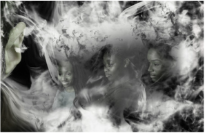
THE THREE BULLIES
|
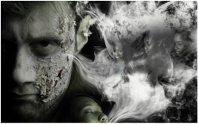
In the trailer we show you scenes of where the bullies start to torture Alice and of course we have to show their face in order for the audience to get an understanding of the story-line and so they understand the characters a bit more. We also decided to put the these three bullies in the poster through the smoke in order to make the poster look more creative and also do to the fact that Dr Barbitus isn't the only problem in the story
|
|
Typography
THE TITLE OF THE OTHER FILM
|
|
|
TEXT
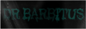
The title of our film is one of the most important font of our brand,the first image is the title of our film that was presented in the trailer, we had to show continuity with the three projects,in the trailer we also added smoke behind the font so that it was more recognisable, due to the fact that in the poster we have smoke coming out of the mouth of one of the main image's. The same font is also presented of the magazine again advertising the brand through other media platforms.

|
On the left side we have a screenshot of what the website looks like and because the our project is surrounded by the topic of social networking sites and the internet we wanted the website to give that same type of vibe so we used a font that is very similar to the old fashioned type writer which we loved, and of course we want the trailer to give the same effect, but more digital so we got the font that appears on digital clocks to get that technical type of feel.
|

|
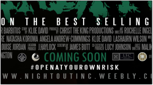
CREDITS

The top image is what we put on the poster of the our film, this is juts basic information on the movie that will soon be release like the production company and who will be featured in the film. We also incorporated it in the trailer which is shown in the bottom image which repeats the same information. which also shows continuity within our two pieces so if an audience member was to see our poster and trailer they would recognise each other through it different elements of font and colour. We also added the touch of in the trailer behind the information we put moving smoke similar to the poster as it has smoke on the poster going through one of the main images' mouths.
ICons
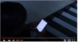
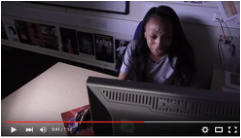
INTERNET/MOUSE
|
|

|

An important icon from our story is of course the internet, as the sub text is surrounded around the topic of cyber bullying in a more of 2016 society, what we did to represent this in the trailer was by showing links and people of their phones either the Dr Barbitus link or social networking sites where bullying takes place, so we tried to show that the best way that we could. we then incorporate the same vision and icon of the mouse representing the internet,cyber bulling and social networking which was why we decided to have the mouse choke her signifying that social networking sites and the internet can be suffocating to some people and its not necessarily due to the sites but the other people in the world that have it also and turn it into something negative.
colour scheme
The colour consist of grey, turquoise/green, white and black, we decide that we do want our poster or trailer to look like the common horror poster or common slasher poster with the red signifying blood, so we chose the turquoise/green because it is equally as bold as red, its different and it goes well with the sub genre, we though of when sites are in process of being made the coding is often turquoise/green so it does go well. Of course we wanted grey, black and white the basic gloomy colour that can really help when it comes to making things scary, and especially major colours in the theme of horror.
|
We wanted to make sure that the colour was well presented across not only our film but through our website which we did with the little titles and text boxes showing continuity throughtout and along helping with the clearness of the website.

|
|
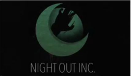
Logo
|
|
|
With the logo in the first image we have is from the trailer where we showed it at the beginning with a green tint over it also like we had in the poster, again showing continuity, it has the same when it comes to the forms of how it is suppose to look, the font how ever is in a different place compared to the original, we alter the font to be positioned below the icon so that the name of the company can be seen. On our website we advertise our logo alot and is represented on most of our images, it is also displayed on the top of our page on every page. In the last image we have our logo displayed in our poster, which had to be there of course among with other distributing and sound companies, but the difference between Nightoutinc and the rest is the tint making it fit more with the main image.
Brand identity
|
WARNER BROS (ORIGINAL LOGO & ALTERNATIVE LOGO)
|
WALT DISNEY (ORIGINAL LOGO & ALTERNATIVE LOGO)
|
|

|
|
|
|
Warner Bros. Entertainment Inc. (commonly known as Warner Bros., Warners, or simply WB) is an American entertainment company that produces film, television and music entertainment. As one of the major film studios, it is a division of Time Warner, with its headquarters in Burbank, California. Warner Bros. has several subsidiary companies.
|
The Walt Disney Company, commonly known as Disney, is an American diversified multinational mass media and entertainment conglomerate headquartered at the Walt Disney Studios in Burbank, California. It is the world's second largest media conglomerate in terms of revenue, after Comcast.
|
NIGHTOUT INCORPORATIONS (ORIGINAL LOGO & ALTERNATIVE LOGO)

|

|
Alternative logos are always good if your original logo doesn't fit a certain theme , so you can always alter it, we liked the idea that you can have a 3D logo and a 2D logo but still representing the same company or subsidiaries within that company. We like how Warner brothers alternative logo had a simple touch to it and consist of only black and white which is where we mainly got our inspirations for our own alternative logo came from, we do love how Walt Disney used three colour to make the text stand out which is why we made the scratch red so that it stood out.
|
|
|
aDVERTISEMENT
|
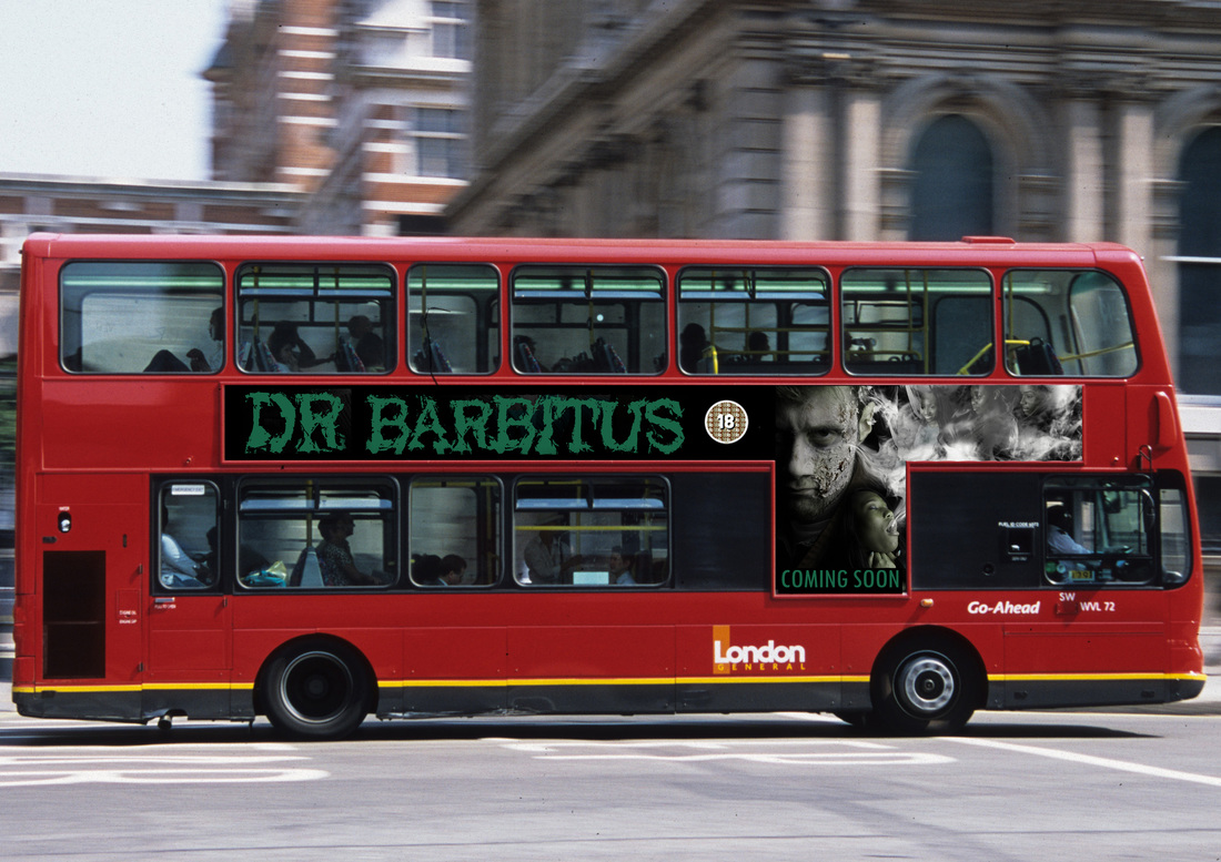
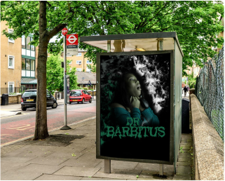
Here is Dr Barbitus being advertised via Bus Banner this is very good for the brand as they the bus travels places day and night so it can catch people attention at any time and any place, they can be looking at it without even noticing that they are looking at it, which is exciting for us to know people look at the banner and because they are intrigued, they want to find out more about the movie leading to expansion of the brand and expansion of audience. we decide to use the same images from the poster so that people who have seen our poster and see this banner can notice it and show there friends .
|
|
Here is Dr Barbitus being advertised at a bus stop this is also very important as people come the bus stops daily, pass bus stops etc, so again this is reaching out to more potential audience members and also if something is there for like a week or 2, it will be something that locals remember pressuring them to want to go out of there way to look for the trailer or even go straight to the cinemas to see the movie. Technology is also evolving cause people to do there research will outside or even at the bus stop with will lead them to other exposure of our franchise and more.
|
|
endorsements/ Merchandise
CINEMA/ODEON PACKING ON SNACKS
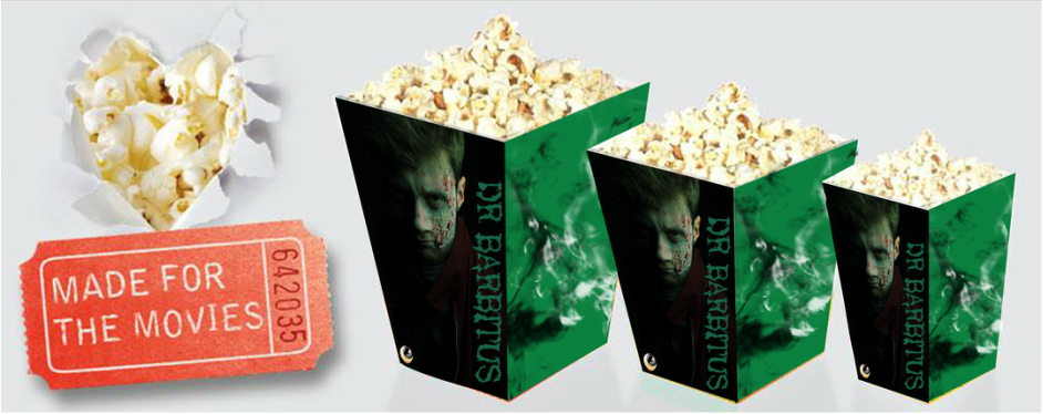
We also wanted to show continuity advertising our brand but go with a simple design with the packaging at the same time, so we went with smoke on one side because smoke alone is a every big impact on our franchise and is recognisable from our poster, and the face of dr barbitus on the other because he is basically one of the stars from our film, this also allows boths side to stand out with the contrast of colour between the two
|

The Dr Barbitus brand doesn't want people to forget our names we want people to be able to see us everywhere, with this snack endorsement we have going on with most popular cinema and odeons in Europe, this allows us to promote our movie not only while watching our movie but while watching someone else's movie so when you look you'll think to yourselves when i next come to the cinema i want to watch Dr Barbitus, and also when you leave the cinema but you didn't finish your snack and have to take it home people will see it on the way , branding the franchise once again
|
SHISHA PEN (DR BARBITUS EDITION)
Dr Barbitus franchise also decided to do a shisha pen edition, shisha pens and shisha hookahs now a days are really trending in society,Shisha pens are now more technical so they fit well with the 21st century, they are now more common than actual cigarettes and have more flavours for people to enjoy more. The Brand wasn't sure about doing this as it could be a very touchy subject to touch on but as it is trneding right now in society and not everyone has to buy it, if you like it then this applies to you, this also suits the age range target audience and our brand targets to people who are grown adults so they can make the decision on whether or not they want to buy one
|

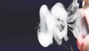
Our Shisha pens have our own touch to then and are quite unique compare to other shisha pens, most shisha pen consist of one colour and one flavour with ours it consist of the packaging with two colours and with the flavours of blueberry and vanilla, Blueberry being on of the best and favourite flavours and vanilla being the new flavour. The package really advertises our brand with the colours, the smoke from the Dr Barbitus poster and relating to why people buy shisha to smoke flavoured smoke, also by putting the title of our film so that people can know who put in work on creating this unique flavour and why we did it.
|
gAMING
|
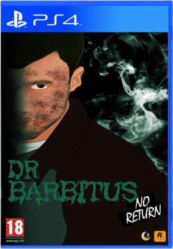
Gaming has a big part in the entertainment life and applies not only to older gamers but to young gamer so that even if they are too young to watch the film they can still ask their parents with their permission or an older sibling to buy the game for them and feel that same experience of what the film viewers get on a gaming level. The fact that we have the game on both PS4 and Xbox 360 shows that we don't want to just limit are gamers to one console. The image of Dr Barbitus is very similar to the poster which allows us to show continuity through different media platforms and make it recognisable to our film fans.The Cartoon/ 3D looking Dr Barbitus gives gamers a feels that the game will take them into a virtual world of the film but in more details and bonus editions.
|
|
HOME STREAMING
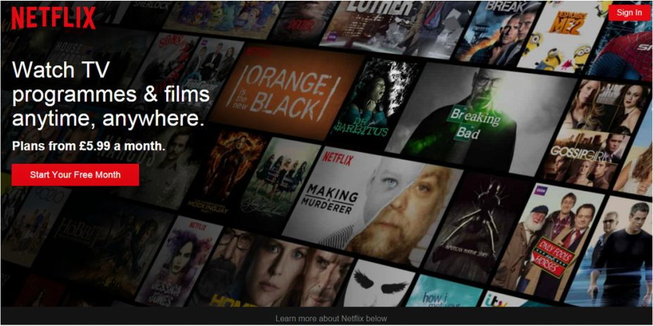
Netflix is a global provider of streaming movies and TV series, and now has over 75 million subscribers and its also appeals to many home viewer so it allows us again to brand our film and our franchise. This the page that Netflix takes you to if you aren't a member of netflix or if your haven't sign in , these are the popular selections or Movies and Tv Shows to chose from and for Dr Barbitus to be apart of the selection can brand our film and catgorise oir films as one of the greats or one of the popluar film to stream.
Conclusion
In conclusion, We believe that the Dr Barbitus Brand have successfully developed as a franchise and with using Syngery and Cross Media Convergence expanded on another level, we have realised that by looking at research such as the Friday the 13th Franchise can really help us and show us how to successfully continue to grow the brand over a long period of time even when release of film making are finished. We discover that taking into consideration of are target audience is also a key point and decision to make when decide what forms of sygnery across different media platforms should be used. We have comfortably found a technique when it comes to who is that face of our brand, similar to how Jason is the face of Friday the 13th's brand, Dr Barbitus being our face of our brand and smoke being one of our signature icons. Overall, Dr Barbitus is entertainment for all and we believe we have successfully delivered that message to our audience through our choice of advertisement.
