
Another part of the pre-production procedure was the print design of our horror film poster and magazine. This included making drawn specimens of what our magazine and poster could resemble. Thus, we needed to take a look at normal traditions for blood and gore movie notices and also ghastliness magazines. From this had the capacity make our drawn drafts and additionally clarify the purposes behind our decisions. And our drawn drafts, we additionally needed to take a look at genuine media content illustrations of magazine spreads and notices. Therefore, we picked parts of the genuine media messages that we enjoyed and clarified why. Taking after on from this, we made a scope of advanced drafts for both our magazine and poster that exhibited the different designs we could utilize. The drafting stage likewise included taking draft photos that displayed the camera shots and edges we may utilize. Ultimately, from this we made working drafts of our magazine spread and blurb which helped us to try different things with Photoshop ability and procedures.
Real Media text - Horror Posters

With this poster we like the idea of the image consisting of two people perhaps the protagonist in the middle with the middle shot and the antagonist in the background with the close, what we liked is that the person with the mid shot back is turn away from the audience giving us a sign of mystery as the audience won't know whether or not the main image is a bad or good guy. Also with the colour scheme it has a lovely contrast between the two colours making the information of the film stand out. The protagonist has a knife in one hand and a mask in the other,which in a way confuses us as we don't know whether the person is really the antagonist or the protagonist, and really get the audience thinking and conjointly connotes complexity
|

From this poster we like the contrast of good and evil, the hand being evil and the screaming face being the victim who was or is good. We feel like the main image is the most eye-catching thing of this poster as it is very different and unique, it is also compliment horror as you can see the devilish spirit coming out of her mouth in a human form. From the whole main image we get a vibe of the film being a psychological themed horror which in a way is good because they are able to tell them what the film brings but still manage to keep things very private. we also like the fact that the main image blends well with the title of the film and the tag line which allows the audience to put all the pieces together. with the font used for the title we like that it is very creative also and still manages to fit into the colour scheme.
|

With this poster we like the idea of the antagonist being the cover of the poster also the fact that this face is cut of a bit also that he has a mask on hiding his identity which basically connotes secrecy as well as what is very interesting that the mask is smiling but looking form the protagonist's eye he is serious under the mask which makes it looks scary. With this poster one thing that was discussion-able is whether or not the poster is visual engaging due to the fact that the font was plain and the color scheme consisted of one color making certain thing not stand out, but then again the picture is very bright and stands out so the contrast compliments each other well.
|

From this poster what we like the most would be the main image, we love the fact that it looking like the woman was recording and it caught an the footage where she was attacked or something similar the scenario. We also like the color which makes it look very technological. In a way the poster is scary representing horror due to the woman in the picture who is screaming on the other hand the poster looks like the movie is rated a 12 or 15 because it doesn't really show any icon symbols like weapon or masks etc.
|

With this poster what we love the most is that monster in the poster is created through the dripping of blood coming from the girls hand which we honestly very creative and would love to incorporate creative idea like that in our ideas also. we also like the little things in the poster as well that add to the scary effect such as the cracks in the corners on the walls, the iconic symbol of ropes on the ground. We like the idea that the title of the movie is positioned in the center compare to other poster who's title is normally positioned on top of the credits of the film.
|

From this poster the thing that stands out the most for us would be the title, the typography correlates well with the name of the movie it is spaced out and has shadow which could represent like an echo being an antonym of silence. We like the concept of the fact that the hand and the face of the main image don't match at all which incorporates curiosity. We also like that the tag line is under the title which is very rare and different compared to other posters.
|
|
|
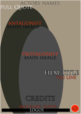
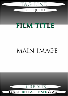
INitial visual drafts |
|
These are our beginning attracted drafts high contrast to indicate generally what we need our magazines and posters to resemble. We have incorporated a portrayal of our fundamental pictures with included traditions of magazines and posters.
Hand drawn & digital drawn posters
We first sketched out our ideas so what type of main image we want on out poster then where to position the text like the title of the film, the tagline, the credits , release date etc. we then developed it further on Photoshop to add colour and experiment with different colour schemes we like.

|
From a lot of research we could see that may posters consist of the protagonist as their main image without giving away any ideas on whether or not the person will save the day, they just manage to make them look vulnerable, so we like the idea that the protagonist looks scared almost like a victim and with a hand over her mouth representing and introducing the antagonist at this stage we weren't too sure what we want the antagonist to look like so we made it look like a normal hand then developed it to look scary similar to a deformed hand. The concept of the mouse choking her really comes from the story line ,where the website causes people to do bad thing to harm themselves which is why she is bleeding from the cord which is our way of representing our iconic symbol. The typography of the film title we thought matched well with intense bleeding from the main image's neck.
|

|

|
With this poster we thought about the main image relating to the back story of our film which is why we have an image of a person with their had on the mouse incorporating our theme of cyber bullying but we also wanted it t look scary so that it matches up with the rest of the industrial horror posters so we decided that the hand on the mouse should consist of blood but we are still uncertain whether or not the hand should be the antagonist or the protagonist. We followed the simple layout of real horror posters where the title of the film is above the credits and the release date is towards the bottom of the poster, what we did do differently on the other hand was make the tag line go under the title rather than on the top of the page but we are still discussing where we should should be
|

|

|
with this poster that we made we like the idea of no blood shown or any sort of thing that relates to horror because it makes the movie seem a bit mysterious. The reason why we decide to incorporate a computer because most of the action is based because of the website and similar to the teenagers in the movie they believe its just a normal link on a normal computer so in a way we are sinking the audience into the same trick because by looking at this they might think the film isn't as scary or gruesome compared to other horror film. with the colour seem we like the idea that of the turquoise colour similar the colour of digital clock so it give it that sort of effect when it comes to technology
|

|

|
with this poster we wanted make the main image relate to the title of the film even if the title is just a play on words, so with the main image even though we aren't sure what the antagonist should look like, through experimenting we put him in a doctor or surgeon's uniform so he looks like a real doctor but normal doctor a usual clean where as this one is covered in blood so that is gives impact along with the fact that the movie is a slasher, and slashers are usually bloody and gruesome. with also wanted to incorporate the protagonist without relieving to much of the film which is why we have her in the back in a shadow form this why the audience isn't sure whether or not she is another antagonist or a protagonist.
|

|
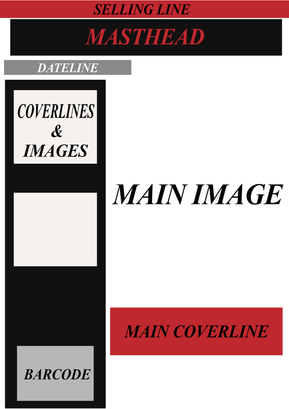
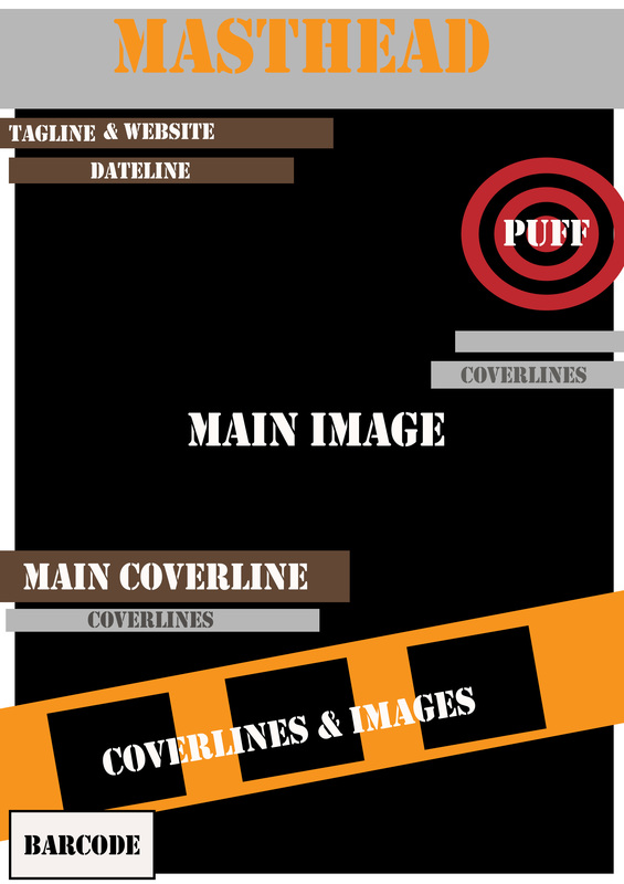
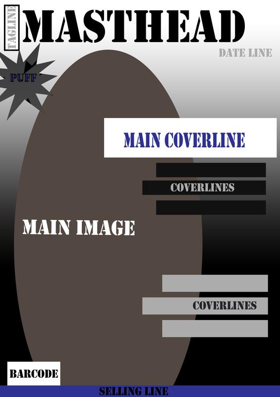
These are our digital draft which help us have an understanding where certain things should be on the poster following simple conventions from other horror poster and we are allowed to experiment with our own style incorporating colour scheme that we like also.These 6 are the layouts we like the most and give us an idea of what one we should chose for our final piece.

|

|

|
|
|

|
experimental Layouts - Poster
These are experimental layouts for our 'Dr Barbitus' Trailer poster, this basically helps us with the idea of where we want certain thing to be positioned, it also make sure that we don't miss out any poster conventions, making us on step closer when it comes to the final outcome.


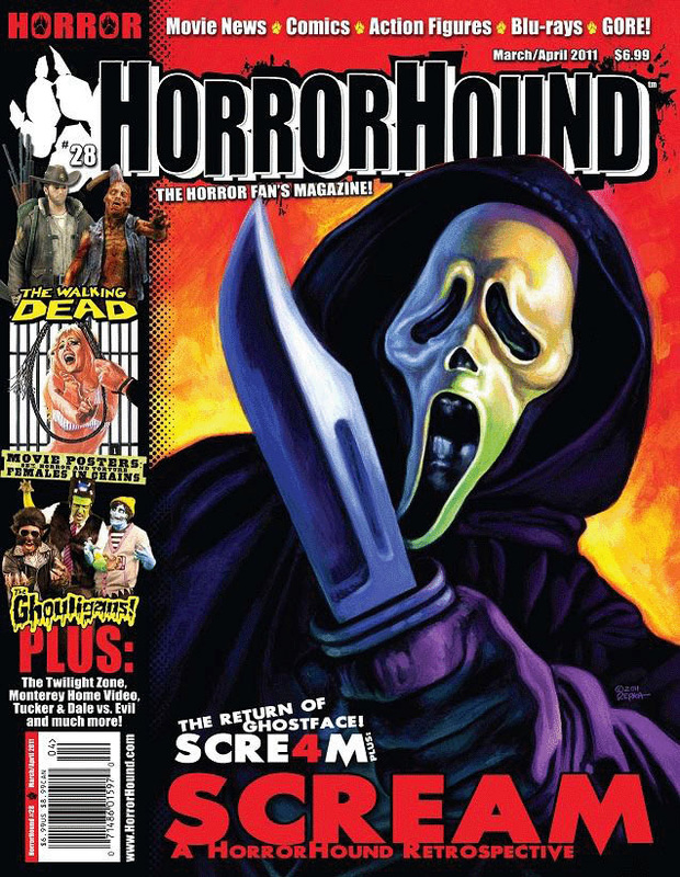
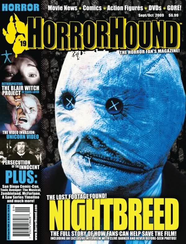
real media text- horror magazines

With this magazine the thing we like the most would have to be that the sub heading's images are blending into the main image taking complete attention from the main image but still very noticeable. What also stands out is the main image we like that fact that it isn't as gruesome compare to other horror magazines but is still looks scary with the dull lighting and the eye edited into grey coat. It is also interesting and creative that the main heading line is in the middle of the main image's weapon and the typography goes well with the weapon
|

From this magazine we love the simplicity of the magazine like we are able to focus on one thing without getting confused about everything else that is going on. with the main image it is very interesting as it gruesome but it is also hidden which captivates people wondering what actually going on causing them to pick it up to read. we also love the masthead's font with the cracks in the middle
|

With this magazine what stood out the most for us was the main image we love the fact that the background and his body colour blended so well together, we also like that with the main image he's body is deformed and wrinkled in a way and they incorporated it in the same way with the main cover line , with horror magazines we like that it has side bars in order to add other features and to draw attention to the audience
|
From this magazine what we love the most is the colour scheme ,we love that everything blends so well together and things don't look too jumbled ,it just looks very organised, also when magazine follows a certain colour schemes with limited colours most of them have some where it would contain of most one colour for example if it had red in the colour scheme the magazine might look like everything is in red. What we also like is that the main image has a cartoon effect to it so it may draw attention not just to horror loves but youths too
|

From this magazine what we love the most would be the different types of typography on the page it is very eye catching especially because of the colour that the fonts consist of. we also like how the main image its cartoonish and many cartoons tend to be less scary because it doesn't look realistic but with this one with the gruesome image it allows the audience to still look at it and say that is just as gruesome as real images. we like the idea of the sidebar going across the main image also
|
What we love the most and what stood out the us was the colour scheme we like the idea of a bright colour and a cool colour coming together to make something stand out so much, we also like that the main image also follows the colour scheme as it blends well. With other magazines their background of their main image is normally plain or has some sort of location behind it we like that this one is a sort of pattern and a pattern of faces also.
|
|
|
INitial visual drafts |
|
Hand drawn & digital drawn Magazines

|
With the first magazine draft we made, we wanted the main image to look a bit gruesome so that the audience knew that our magazine was a horror magazine as it wasn't recognisable from the name of the magazine ‘deface’ alone. I loved the typography for deface as it aloud it to look bold and horror at the same time so we thought that we should keep the typography the same for all draft but change it up according to the colour scheme of each draft. With this colour scheme from research the colour are very common and well known in the genre of horror and it also allows certain things to stand out and attract the right type of audience
|

|

|
with this magazine our main concept was to incorporate the colour scheme of Orange, Black and white because we saw it from a real horror magazine and we love the way that it was different from other horror magazine but still managed to keep the horror style. It also appears as if Halloween is all year round which we loved. with the main image we decide that a mid shot would be good allowing the audience to see the main image's costume which is very important in horror because that how the audience can tell whether or not the person is the protagonist or antagonist. with this main image we didn't make it too gruesome compare to the first draft and decided to show blood only on the main image's hands. we also loved that the side bar of other cover lines go across the main image which makes them stand out more
|

|

|
With this magazine we tried to in corporate a mid shot but with the main image not complete in the picture and with them not giving eye contact which we love because it makes the image look more natural instead of posed, we also love from real media text the blend of a bright colour and cool colour so we tried to replicate the same type of idea, with the side bar most magazines that have sidebars look busy and very engaging which we would like to do in order to get our audiences attention.
|

|

|
From many horror magazine we have seen not many of them have close up because they normal what to put the costume of the main image in there, we thought that a close up would go good with the horror genre as you can show scary in facial expressions and within make up so we had that type of vision also because we would like our magazine to be called 'Deface' it would make sense to have a deformed face as the front cover because defaced means spoiled surface. we also didn't want to do to much with this idea because we want the audience to focus on the main image.
|

|
These are our digital draft which help us have an understanding where certain things should be on the magazine following simple conventions from other horror magazine and we are allowed to experiment with our own style incorporating colour scheme that we like also. These 3 are common layouts that we like the most and hope to follow out in our final piece.
|
|
|
These are experimental layouts for our Horror Magazine, this basically helps us with the idea of where we want certain thing to be positioned, it also make sure that we don't miss out any Magazine conventions, making us on step closer when it comes to the final outcome.
Experimental layouts - Magazine


|
|
Test Photography |
|
|
|
|
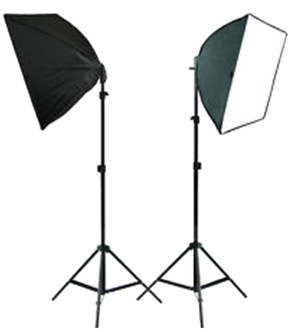
This is the first photo shoot we did together as a group we each took turn being both the cameraman and the main image so that we all experience the feeling of how to make good picture, we also had studio lights which we were new to also, we did start to get the hang of it after a while in order to get the perfect lighting that was too bright or too dull. Overall we think our first photo shoot went well as we got a chance to learn new techniques and have fun with the costumes at the same time.
|
|
Good and Bad quality photos
As a group we decided a looked through the picture we looked a which picture had good quality and the ones that didn't really meet our standards. It was good for us as we got t experience the difference between magazine quality from phone quality
Bad Photo
This photo wasn't one of our best qualities as the lighting isn't quite good, even though it give a gloomy look it makes the picture look as if it is out of focus.
|
GOOD qUALITY pHOTO
This Photo is good quality for a close up as the image is in focus allowing the audience to see facial expressions clearly. it is also a good quality photo because the lighting isn't too bright or too dull its just right for both the antagonist and protagonist.
|
|
|
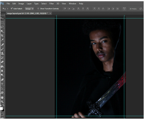
Working drafts - Poster |
|
Stages for the First Draft - POster
These are our first experimental photos that we took in order to get an idea of how the main image would look on our poster or magazine by not only using our visual thoughts but by the audience research results that we gathered from our potential audience, we took a range of different shots of our potential protagonist and antagonist using different props,certain lighting angle and various poses.

The first thing we had to do was to import the picture onto photoshop and expand it without spreading the image un-proportionally so we expanded it the most we could be it didn't cover the corners
|

So what we did was add a black background behind the image and by using a layer mask and a soft brush we black the image into the black background making it one, we also editing the picture through brightness and contrast to make it have a shadow effect
|

after doing that we start to add text such as the credits and the actors name and with help from the grid in order to make sure they were all in line and shared equal amount of space.
|

|
We were pleased with the overall design of the first draft we liked the idea of both protagonist and antagonist as the main image we like the turquoise colour coordination in the colour scheme and it is very rare to see in a horror poster so we like the way we made it unique but still manage to follow the typical horror convention of a film poster. overall we are happy with the positioning of the text and like the different fonts used for different section in the poster. This draft will now help us have a better understand of what our final will build up to from this, and how we can arrange certain things for our poster to look amazing
|
We liked the idea of having a bright colour scheme but still trying to maintain the scary/horror type of look so that's the reason why we decided to put a bit of turquoise in there.
With the title name 'Dr Barbitus' we liked the fact that with the font it looked slightly smudged like a blur effect, similar to as the Dr is a play on word it makes the audience feel as it they are seeing it correctly. 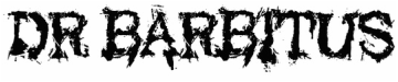
|

|
With this outcome the thing we was most impressed about this outcome was the fact that the main image was cut off the page so it gives the audience only a snippet on what could be in the film and it also gives more space for other poster conventions to be positioned on the poster, in order to make the poster look busy and now cramped together.We also really liked the colour scheme and how it made things on the poster flow in a way, and also the gradient of grey and white and the bottom where the credits are.
|
we decided to use the colours dark red, grey and white in order to give the slasher poster and more horror look,as from most of the real media text the poster mainly had some sort of red in it, giving it that gory look. We incorporated 'Based on a true story' from the poster conventions, in order to get the audiences attention you could either put this or a pull quote.

|
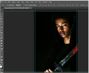
Stages For the Second Draft - Poster

The first step we took in creating this draft was by import the picture onto photoshop and expanding it, the picture was originally a centre mid shot but through expansion we turned in into a side mid shot where half is cut off slightly
|

Our second step was to edit the image so we used the brightness and contrast tool in order to use the shadow effect then we added the colour balance and adjusted a few levels in order to get a cool looking over glance on the image
|

Then with the help of grids we added typography onto the poster and this time decide to add a pull quote -'Based on a true story'
|
|
|
Working Drafts - Magazines |
|
Stages for The First draft - Magazine
|
The first thing we did was import the picture onto photoshop and expand it towards the right side of the magazine
|
The second thing we did was adjust the brightness and contrast and then added a colour balance on top in order to get a yellow fade colour on top but not completely.
|
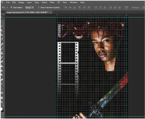
We then added the film strip and added a gradient on it to make it follow the horror vibe and with the grip the masthead could be placed straight.
|
Stages for The Second Draft - Magazine
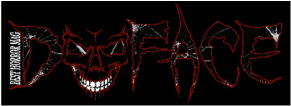
With the masthead we wanted to make it interesting and eye catching so considering that Deface was one of our options in Audience we thought it would be a good idea to but a face inside the words and replacing the 'E' with the skeleton face was a good look as even with the e missing it still spelt Deface. we also decided to fill the inside with a broken glass type of texture to make it different from the background.
|
Overall we were pleased with the final outcome of this magazine front cover, the thing we like the most would have the masthead we love the level of creativity that we put into the masthead which is good as it is eye catching tot the audience when they pick up the issue. We also like the main image how the direct contact adds tension which helps with the idea that it is a horror magazine. we tried to follow as many magazine convention in order to make the magazine look as realistic as possible. the colour scheme idea simply came from the real media text and how most magazine incorporate red representing blood, so we thought it would be a good look.
|

|
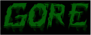
By doing this typography and style in the masthead really helped us be creative and gain skills with Photoshop we started of by downloading a font and developing it by duplicating it with different shades of green and using different soft brushed to make a shadow looking drip almost like fog.
|
With this design we love how the lighting helped enhance the main image a bit more, it consist of the same convections as the first one which really helped us understand layouts of how horror magazines should look, so we simply rearranged certain thing till we came up with something that we liked as a group. We decide the masthead should look the name of the magazine and 'Gore' was one of our option from Audience Research so we made the typography bold and added smudges to give it that steamy but gross look so it eye catching also. We followed the colour Scheme of Green,Black,White and Grey but we thought gore would look good with green and the colour compliment each other well.
|

|

So we imported the picture onto photoshop but because we wanted it to look like a mid shot we didn't expand it the whole way across the page
|

then we added a black background so the picture would look full across the page and by using a layer mask and a soft brush to blend the background with the image, and in terms of editing the picture we use brightness and contrast then added a colour balance on top to in enhance the shadow look.
|

Finally we started to add the text and the sidebar but we decided for it to across the page and we add the same type of gradient as the first draft
|
